Showing posts with label Amy Bissell. Show all posts
Showing posts with label Amy Bissell. Show all posts
Monday, 23 April 2012

Wednesday, 18 April 2012
Amy Bissell - Critical Evaluation - Question 1
Q1: In what ways does your media product use, develop or challenge forms and conventions of real media products?
We had planned from our initial brief to make
our film fit the romantic comedy genre.
We each took part in researching into elements of genre, such as
romance, drama, romantic comedy and comedy itself to give ourselves an in-depth
knowledge of what an audience expects to find in each. We found that romantic
comedy was quite a typical genre and has a familiar structure, (See Below). Although elements of our film fit to this
structure, (boy meets girl, conflict, obstacles) it also contradicts the genre,
as there is no real threat to the couples’ relationship and there appears to be
no happily ever after at the end. Romantic comedy is not the only genre our
film fits. Theories like Steve Neale’s believe that genres are interlinked as
hybrids. Although not totally apparent, our film is a hybrid of romantic comedy
and science fiction (a.k.a. Sci-Fi) with the frequent use of possible future
technologies.

To plan, we first brainstormed as a group to
choose collectively basic plot and structure of our film. We took our research
into genre further by watching clips of romantic comedies to study the
locations, characters, costumes and overall editing. I choose to study a clip
from “50 First Dates” (See Below).
Influence from films like “50 First Dates” and “Click” gives our film
intertextuality. We also researched into short films on websites such as ShortsBay to see what makes a short
film.
We edited our film on Final Cut Express. Our film features a large number and variety of
jump cuts to make longer periods of time in our film pass by quicker as we only
have a restricted 5 minutes. Our film also has a non-linear narrative, starting
in the middle of the story, cutting back to the start of their relationship,
and finishing with the end. To make the transitions more fluent, we added video
transitions and some freeze-frames with voiceovers. We also used a combination
of music and voiceover to create a montage to make the passage of time quicker
and more fluent. We also used Final Cut to alter the speed of our film in the
“rewinding” scenes, we simply selected the footage we wanted to play backwards,
went to the “Motion” tab, select “Speed”, changed the duration to the desired
speed, usually around 2 seconds, and then select “Reverse”. To make it more
realistic, we also added sound effects from royalty free websites like SoundJay, of a cassette tape rewinding.
We maintain continuity while editing by
keeping to the 180-degree rule in our shot reverse shot scenes, and also edited
the lighting by adding filters to alter colour and brightness. These filters
made the transition between shots seamless even though they were filmed on
different days and at different times.
Our film aims to make a statement about
todays world, in terms of technology and relationships. First with the remote
and its effects on the universe. When does technology go too far? When is
enough, enough? We hope our audience will question whether they would like a
remote like the prop themselves to remove mistakes or would they rather be
liked in a relationship regardless of imperfections. The remote is used as more
than a prop, but as a symbol for todays’ society and the image of perfection we
are obligated to fit. Buscombe theory of inner and outer forms of genre relates
to our films sci-fi elements. Although the remote serves as an outer form, a
prop as a visual convention for the underlying sci-fi element of our film, it
also serves as an inner form to express the moral of the story. Hopefully,
after seeing the disappointment of the characters after the effects of the
remote, the audience will come to the conclusion that perhaps the remote is not
the answer. Our film also challenges the idea that men hold more power over
women, particularly in film. Although our
lead character is male, he is portrayed as a vulnerable character, at the mercy
of the female, and although he is control of the remote, she has control over
the date. It challenges the conventions of film. But in the end, both
characters are revealed as vulnerable, as she has a remote as well. This
relates to Rick Altman’s theory of semantic, syntactic and pragmatics as it
features elements of all three:
- Semantics – visual conventions of
the genre. (Boy meets girl, date situation of having dinner, flowers.)
- Syntactics – expectations/ideals
of the narrative. (Power struggles of relationships, sexual under theme, the
search for love)
- Pragmatics – influence of
audience/institutes. (Power struggle between men and women where the male has
the upper hand – however in the end we have equilibrium.)
The audience should receive forms of pleasure
through watching our film. Richard Dyer’s theory of “Utopian Sensibilities”
believes audience seek pleasure for an element they lack in their own life
through films. Our film provides:
·
Intensity in its characters
alternating moods for those who have a ‘boring’ or ‘mundane life’.
·
Transparency as our leading male
has clear emotions through his facial expressions, dialogue and inner monologue
for those tired of ‘lies and manipulation’.
·
Most importantly, community for
those who are ‘lonely’, as even though the characters are conflicted, they are
both presented as hopeless and in a way, meant for each other, which should
give our audience a subtle hope.
The majority of the short films I know have
an experimental or educational feel, often used as a form of expression or to
give a moral. Some are even used for advertising, such as the short film I
analysed called “The Star”, which is
an advertisement for Mercedes. “The Star” was quite different for a short film,
as it is filled with high profile celebrities, like Madonna and Clive Owen, whereas
usually short films have unknown actors due to their budget. It had a male V.s.
female dynamic, similar to ours. Ours also has a male/female V.s technology, as
does “the Star” where Madonna is at the mercy of the Mercedes and her Driver.
It has elements of physical comedy very similar to ours, for example when the
Star spills coffee on her trousers, which is mistaken for urine. They use some
similar editing techniques to our film, for example they alter the speed of
some footage and use overdramatic music for comedic effect.
Amy Bissell - Critical Evaluation - Question 2
Q2: How effective is the combination of your main product and the ancillary texts?
Amy Bissell - Critical Evaluation - Question 3
Q3: What have you learned from your audience feedback?
.jpg)
Amy Bissell - Critical Evaluation - Question 4
Q4. How did you use new media technologies in the construction and research, planning and evaluation stages?


I was also had to alter the audio levels of some shots, for example when adding our voiceover recordings. Here, I altered the Level from 0db to -5db and the Pan from 0 to -1, making the recording quieter.


Some shots were also adjusted using the framewire feature to edit their composition on screen. Below is an example, while I was creating the title sequence which involved editing the wire frame of nine video clips on separate layers. When I decided how big the first would be, I simply copied the number in the "Scale" box on the "Motion" tab so they would all be the same dimension.


When creating the radio trailer on Final Cut Express and also used Garage Band to edit sound. We selecting a scene which gave a good representation of the plot and themes of our film, selecting the audio to make a sequence (this was now a sound bite), then we added a recorded voiceover which said our tagline, then adding a final layer of music from our film to give the advert synergy to our film. Final Cut made the process very easy as if was easy to cut each audio on its own individual layer. We could also edit the level of volume on each audio to make the voiceover and sound bite over power the music volume. We wanted to add a distorted and echo sounding rewind sound effect, and use Garage Band to alter the sound, then adding it back to Final Cut to make the final product.

Our poster design was created on photoshop, using original photos and images that were royalty free. We created a friendly colour scheme to make the advert inviting to show the air of romance in our film, but also had a comedy theme with the context of the actors and what they were doing. We able to edit a photo of our actor into the screen of a television, appearing trapped by using the Photoshop "lasso" tool to remove the background and a "blur" tool to blend them in, giving the final piece a professional feel.


A: Technology has been the most important feature of my product this year. From the initial research to the final edit of my five-minute film, new technology has played a vital role in my work. Firstly, I have used the Internet, using a Blog to exhibit my work and research in a creative format. My blog had multi-media, featuring text, external link, a collection of borrowed and original photos and even videos, both from YouTube and of my own creation. The Internet was vital for my research, in particular to find examples viral advertising, where I found many examples such as images and interactive website. The Internet also provided opportunities from audience research, as I used the social network site Facebook to gain information through a digital questionnaire via Chat. It enabled me to get a broad audience feedback. I did however encounter problems when uploading my own video’s to YouTube as our college provides only a restricted bandwidth for uploading, but after consulting my tutor the problem was soon fixed. I also used a variety of software on Mac computers throughout my project. I used Celtx to write the script, Word to create a shooting script, Photoshop Elements to create a banner and Production Company Logo, and ArtTextLite and Paint to create our title. We also used websites like eBay, as we created a fake page advertising the prop remote used in film. Photoshop Elements allowed me to use a range of features to edit different layers, much like Final Cut but for images. I could create a background and build onto it with different layers, like imported images, text layers and then clip art. For sound editing in our film, we used a combination of Garage Band and Final Cut together to create an interesting effect on the sound effect of rewind me used to make it sound echoed, and to compile the sounds effects, music and soundbites effectively.


New technology was a big part of the production stage of my film with the equipment used. We filmed using a high definition camera, which enabled us to create a more crisp image. I also gained experience using a Zoom Recorder to create original audio for a voiceover. These details helped to create a more technical and advance final product than in my Foundation year. I was however forced to change elements of my film due to restrictions caused by technology, in particular with focus. Our camera uses a spinning ring to focus, rather than a linear ring, which made it very difficult to focus on objects very close to the camera and also when pull focusing. I was forced to remove a pull focus shot from our film and replace it with a simple medium shot of two characters instead. I also found that the camera and tripod restricted me from filming in a confided area, in particular when I was filming in a bathroom that had little space to fit the camera plus various mirrors. To overcome this, I included two hand held shots rather than using the tripod.


To edit the film, we used Mac computers and various software such as Final Cut Express to edit footage and Photoshop Elements for poster design. I also used other software such as using Celtx to create a formatted script. To show creativity, we created our viral advertisement idea to be featured briefly in our film itself. We used Final Cut Express to edit our advert together. I created images for the advert on Photoshop elements which was imported onto Final Cut, where we also added moving text and copyright free sounds from a website. It combined all our new skills together and allowed us to experiment with the features of Final Cut Express before editing our final product, such as altering speed and reversing the images to play backward. In particular, I did the majority of editing in the group on our final product, which involved trimming shots, importing voiceover audio and copyright free sound effects, applying various transition and reversing visuals and audio. I was also responsible for altering the colour and brightness of several shots and also adjusting audio levels. Here is the step by step process I had to complete for each shot to edit the colour and overall brightness of the shot, (Click to Enlarge). First I selected the shot and clicked the filters tab. I then dragged in a Brightness and Contrast filter and adjusted the levels of each. Then I added a colour filter and added more white and blue to countert the overly-yellow image. You see the end result on the final photo.


I was also had to alter the audio levels of some shots, for example when adding our voiceover recordings. Here, I altered the Level from 0db to -5db and the Pan from 0 to -1, making the recording quieter.

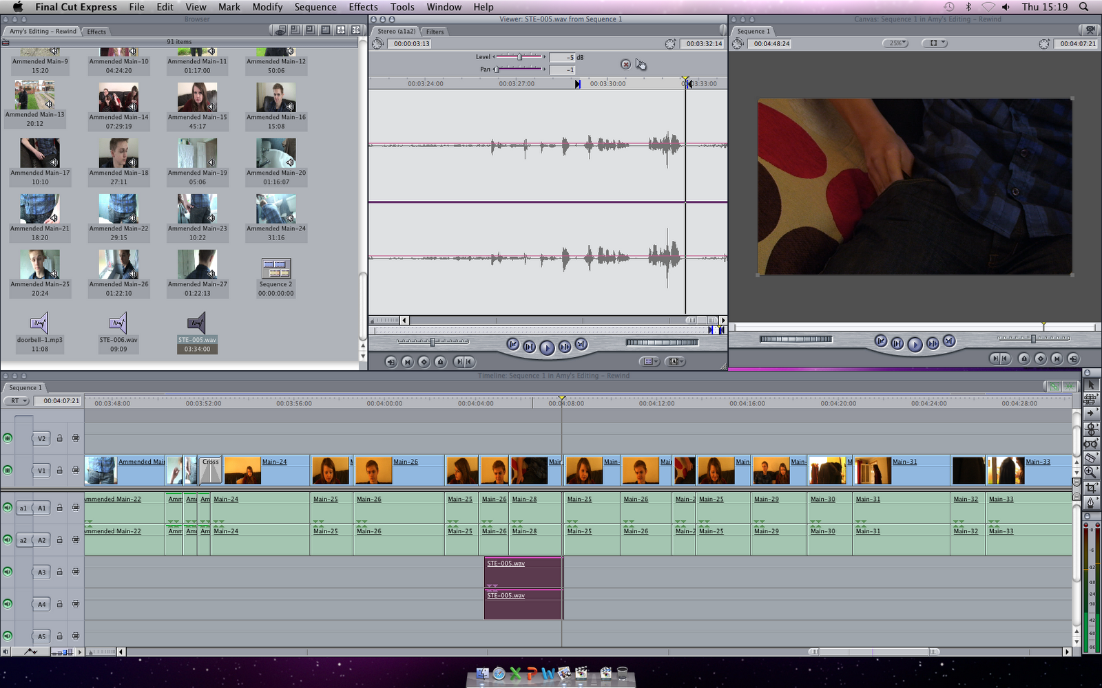
Some shots were also adjusted using the framewire feature to edit their composition on screen. Below is an example, while I was creating the title sequence which involved editing the wire frame of nine video clips on separate layers. When I decided how big the first would be, I simply copied the number in the "Scale" box on the "Motion" tab so they would all be the same dimension.


When creating the radio trailer on Final Cut Express and also used Garage Band to edit sound. We selecting a scene which gave a good representation of the plot and themes of our film, selecting the audio to make a sequence (this was now a sound bite), then we added a recorded voiceover which said our tagline, then adding a final layer of music from our film to give the advert synergy to our film. Final Cut made the process very easy as if was easy to cut each audio on its own individual layer. We could also edit the level of volume on each audio to make the voiceover and sound bite over power the music volume. We wanted to add a distorted and echo sounding rewind sound effect, and use Garage Band to alter the sound, then adding it back to Final Cut to make the final product.

Our poster design was created on photoshop, using original photos and images that were royalty free. We created a friendly colour scheme to make the advert inviting to show the air of romance in our film, but also had a comedy theme with the context of the actors and what they were doing. We able to edit a photo of our actor into the screen of a television, appearing trapped by using the Photoshop "lasso" tool to remove the background and a "blur" tool to blend them in, giving the final piece a professional feel.


Thursday, 29 March 2012
Radio Trailer Script
We created a radio trailer on the sound editor, Garage Band and Final Cut Express, using sound bites and music from our film, sound effects, plus an additional voiceover. This combines the humour and plot of our film and also give promotion. We created two possible scripts and made each. Here are the two scripts:
Script One - The longer script
Music starts:
Jack: Okay Jack, it's all good, don't make it obvious. Reach it over there, nice and easy, this isn't the arm olympics. The old reach around.
*SLAP* (sound effect)
Emma: What was that?
Jack: My name is Jack, I'm nineteen years old and I've never had a real girlfriend. This is the tenth time I've had my first date with Emma, which doesn't make any sense to you at all, but let me explain.
*rewinding noise*
Voiceover: Rewind, coming soon to a cinema near you.
Script Two - The abrupt script
Music starts:
Jack: Okay Jack, it's all good, don't make it obvious. Reach it over there, nice and easy, this isn't the arm olympics. The old reach around.
*SLAP sound effect*
Emma: What was that?
Voiceover: If you had the power to rewind time, would you?
*rewinding noise*
Voiceover: Rewind, coming soon to a cinema near you.
Here are both versions of our radio trailer:
Script One - The longer script
Music starts:
Jack: Okay Jack, it's all good, don't make it obvious. Reach it over there, nice and easy, this isn't the arm olympics. The old reach around.
*SLAP* (sound effect)
Emma: What was that?
Jack: My name is Jack, I'm nineteen years old and I've never had a real girlfriend. This is the tenth time I've had my first date with Emma, which doesn't make any sense to you at all, but let me explain.
*rewinding noise*
Voiceover: Rewind, coming soon to a cinema near you.
Script Two - The abrupt script
Music starts:
Jack: Okay Jack, it's all good, don't make it obvious. Reach it over there, nice and easy, this isn't the arm olympics. The old reach around.
*SLAP sound effect*
Emma: What was that?
Voiceover: If you had the power to rewind time, would you?
*rewinding noise*
Voiceover: Rewind, coming soon to a cinema near you.
Here are both versions of our radio trailer:
In the end we chose to use the second edit, simply because it featured a tagline which made the radio trailer more catchy and memorable. The radio trailer is a fitting advertisement for our film. It has element of comedy which the audience should pick up on and understand.
Our Poster
When it came to making our poster, we desided to go with Joe's idea. His research into Romantic Comedy posters found that many posters have a similar format, including original photos of the main love interests in the film. Here is our step by step process as we created our poster.
Step One - Getting Original Photography
First, we took photos of our actors, a television screen, and our remote control.
(ADD PHOTOS)


Step Two - A Draft
- Then we uploaded our photos to Photoshop Elements. We used a lasso tool to cut around each character, removing the background. We added each to a separate layer so we could alter them each individually.

- We added the title "Rewind" that Amy created previously.

- We found a copyright free image of a static TV and added it behind Jen so she appeared to be trapped in the TV as if controlled by Joe.
- We added the cast names to the top of the poster, above their corresponding actor, using the font we also used on our film credits called "Matroyoshka".
- We added poster credits, also known as a "Billing Block" underneath the title.
Here is the first initial poster Joe created in a sketch format and a photoshop format.


Step 3 - Making improvements
- We were generally happy with the poster but wanted to make a few improvements to the usage of space and composition.
- Firstly, we moved the main features of our poster, the actors photos. We made them much larger and more centre. It made them the most eye catching feature.
- We made the title larger and engaged it more within the poster, integrating it with the photograph of Joe.
- We added a web address below the poster credits to make the poster more multi-media.
- We made the cast names larger and altered their positon to make them more interesting.
- We added a certificate rating, our production logo (inverted), our college logo and a suggested distribution company to give the poster a more realistic look.

We think our poster looks fun and professional. It has a simple idea and mirrors the theme/genre of our film with elements of comedy plus a "Man V.s Female" vibe. The colour scheme is chilled and friendly. It is eye-catching because it features large images and text.
Friday, 23 March 2012
Audience Research - Feedback
To get a reception from our traget audience, we posted a rough version of the final film onto Youtube and uploaded it to Facebook on our three profiles. We each have friends within our target audience range and hoped they would comment with some suggested improvements before we did our final edits to the film. But also to find out if the film has a generally positive reception from the people who watched it. Here are the improvements we are expecting to hear;

Results


- Title Sequence - needs more clips in the blank areas.
- Music - needs more music throughout, in particular the title sequence.
- Sound Effects - TV Background, needs to be louder.
Here is the rough edit we have uploaded. After we have enough results, we will made the ammendments to our film before realeasing a final edit.

Results


We didn't receive all the expected results. Some of the suggested improvement highlighted aspects we really liked and didn't want to change but we did use the results to make some improvements.
- Amended spelling errors.
- Made the music in the delivery scene more smooth, by re-added a section we had previously cut.
- Added music to the title sequence and credits.
Thursday, 8 March 2012
Making the Title Sequence
We have decided to use my idea for our title sequence. First we need to film nine clips in various lengths. So we brainstormed to think of nine events to film. We will film on portable cameras so they each look like home videos. Here is our list:

Then I went to 'Modify', and down to 'Speed'. The first clip was 5 minutes long, so I changed the duration to 10 seconds which made the image move much quicker. Then I clicked 'Reverse' which gave the rewinding effect we wanted.
I applied a 'Fade In and Fade Out' video transition to the start and end of the clip so that the clip didn't just appear on screen spontaneously, but seemed to emerge. Then I had to wireframe the image to change its size on the screen, so that we could fit all 9 clips on in a tiled format. I estimated that each clip would be around the scale of '39:46'.


At the end of all the clips, after the last image fades off screen, I added the title, again using the fade transition. I put it in the centre of the screen and used keyframing to make it appear to pulse out to the audience. The title sequence will end with the title fading away, then with a fade back to the film.

We collected a range of music from copyright free CD's. We choose music which had a fun and feel-good feel. As the title sequence starts, I boosted the audio to make it more prominent, as their is no speech throughout the title sequence. Then when it finished, the music is dulls back down .
Overall, I am very happy with the finished outcome of the title sequence. It quite artistic and interesting to watch, and will engage the audience more than just simple text of a screen. It has a more eye catching appeal.
- Traffic
- Rain/Shower
- Dinner Plate
- Candle being blown out (e.g. on a cake)
- Car journey/bus
- Footsteps
- Train journey
- People (e.g crowd)

Then I went to 'Modify', and down to 'Speed'. The first clip was 5 minutes long, so I changed the duration to 10 seconds which made the image move much quicker. Then I clicked 'Reverse' which gave the rewinding effect we wanted.
I applied a 'Fade In and Fade Out' video transition to the start and end of the clip so that the clip didn't just appear on screen spontaneously, but seemed to emerge. Then I had to wireframe the image to change its size on the screen, so that we could fit all 9 clips on in a tiled format. I estimated that each clip would be around the scale of '39:46'.


Then, I completed each step for the rest of the clips. Then I started to add layers of text, which featured the casts names. I used the font 'Matroski' because it was simpler to our title font and had a fun theme to match our genre of comedy. The text also fades in and out and is also replaced by clips and they come onto screen.
At the end of all the clips, after the last image fades off screen, I added the title, again using the fade transition. I put it in the centre of the screen and used keyframing to make it appear to pulse out to the audience. The title sequence will end with the title fading away, then with a fade back to the film.

We collected a range of music from copyright free CD's. We choose music which had a fun and feel-good feel. As the title sequence starts, I boosted the audio to make it more prominent, as their is no speech throughout the title sequence. Then when it finished, the music is dulls back down .
Overall, I am very happy with the finished outcome of the title sequence. It quite artistic and interesting to watch, and will engage the audience more than just simple text of a screen. It has a more eye catching appeal.
Tuesday, 28 February 2012
The Computer Screen Scene

Our film features a scene which includes recording a computer screen where Jack buys the remote. To make it look official, we created an eBay page for our fake remote. It makes the scene more believable because it is a website we expect our viewers to be familiar with. We also used a shot of YouTube, featuring our viral advert, (See Below), which adds an element of synergy as our products link together, (Viral Advert - Film).

Thursday, 2 February 2012
Filming Checklist
I have created a filming checklist which we will follow when we film the main footage of our project. It outlines the required props, equipment, and also the roles of each group member. Here are each persons roles;

- Myself - Director, Camera Handling. Responsibilities: Bring remote control, mat, digital camera and key to filming location. Bring filming tape. Print a copy of both shooting script and two scripts for cast members the day prior to filming.
- Jade - Director, Camera Handling. Responsibilities: Collect HD camera and tripod and fill out any nessisary forms for overnight use. Collect another tape.
- Jen - Cast, 'behind the scenes'. Responsibilities: Collect handheld camera and tripod. Wear correct filming costume.
- Joe - Cast, Prop Handling. Responsibilities: Purchase flowers on day of filming. Wear correct filming costume.

Monday, 30 January 2012
Problems and Amendments
Due to construction taking place in our original location, we have now swapped to another. We also amended our schedule for film to fit around each of our exams over the January period.
Here is our new schedule:



Here is our new schedule:
- Thursday 2nd February - Recording voiceovers with Joe
- Monday 6th February - Filming all remaining shots
- Tuesday 7th February - Any remain shots in necessary, but otherwise, editing.
- Thursday 9th February/Onwards - Editing
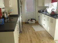
Here are the amended location photo's, which I will make set designs from:


Poster Ideas
Here are my ideas. I created a few general ideas on Photoshop, each with different text and image features for a modern minimalist poster, which are quite common in the independent productions. Below each I have added a brief summary of my thoughts on each poster, and how I would improve them in a second draft. They will then be presented to the group, along with each of their own ideas and together we will decide which elements of each of the posters we like best and create the final draft of the poster as a group.
Poster One

This poster features a minimalist colour scheme with the use of only black, white and red. The actors names stand out, as they are the only red text, emerging from the page. They are also the correct way round, unlike the surrounding white text which is backward. This creates synergy between the title of the film "Rewind" which also has some back-to-front lettering, but also the film itself. Overall the poster is simple yet effective. However, the poster doesn't feature any original art or photography from us, only text and effects generated on Photoshop. To improve we could use a similar format but with photographs added, perhaps of the remote.
Poster Two


Poster One
Poster Two

This poster is the simplest of my ideas, featuring just a rewind symbol and a date of when our product will be complete. This style of advertising has elements of viral advertisement, as people may search on an Internet search engine to find out about the film. Several improvements could be made, such as including a web address under the address. Or we could use a similar style, using a large rewind symbol in the centre of our poster, but using it as a window effect by making the symbol transparent, and applying photographs of the actor behind. It would also be a good idea to add more of a colour scheme as using all black and white, although dramatic and attention grabbing, it almost gives the poster a sinister feel, which doesn't relate to our genre of romantic comedy. I'd consider using more warm colours, to create a happier feel.
Poster Three
This poster is probably the best of the four, as it is the most related to the film. It would feature original photography of the remote from the film itself, zoomed in on the rewind button. I would also use a fade effect to make the button stand out. This was the hardest of the three in terms of composition, and where to place the text without it looking out of place. To improve, we could take another similar photo with the actors hand actually holding the remote. We would need to take the photograph with a high resolution camera to get all the details of the remote. Here is a sketch of the idea:

Poster Four
My final poster again involve original photography of the delivery box used in film, filled with packaging and the remote. It could be formatted to be landscape or portrait. It also features some unique editing as the text appears to be part of the photograph, as if it is printed on the box itself. It is also the only poster where I managed to find a suitable composition to add poster credits which didn't look out of place. Although the packaging is not the same as we used on our film, it relates to the film well and leaves some intrigue as to the plot of the film. Again we would need to use a high resolution camera to take the original photograph in a high quality. Here is a sketch of the idea:

Tuesday, 24 January 2012
Advertising Research - Posters
As part of our project we have to design and create a poster. For inspiration, I will research several film posters of the rom-com genre. I will look for the key features of the poster and the common features they share. Here is what I will look for in each;


- Images and photos
- Colour themes
- Text and fonts
- Position on poster/composition
- It's relation to the film
I picked three random films, one of which has similar films to our own production, 50 First Dates, Along Came Polly and Bewitched.

Image and photos
Similarly, each poster has the couple the film is based on in a variety of situations. On 50 First Dates, Lucy looks shocked, while Henry is seeking her attention. The fact he looks at her and she is looking away presents the idea Henry is more interested in her which fits to the film. In Along Came Polly the roles are opposite, with Polly drapping her arm over Reuben as he looks away. Although the film is more about Reuben trying to win over Polly, she is a outspoken and flamboyant character and the pose matches her. In Bewitched, Isabel is presented as the powerful character and Jack is at her whim. Each of the posters feature a prop important to the film. Oddly enough, both 50 First Dates and Along Came Polly's is an animal character, a penguin and a ferret. 50 First Dates also has a ukulele, and in Bewitched a broom, mirroring the themes of the film as Isabel is a witch. The settings of the posters for 50 First Dates and Along Came Polly are in the filming locations used in the films, a beach and New York.
Colour themes
50 First Dates has a beach theme for the poster so the colours are quite saturated and warm. The characters are also significantly tanned. The text has a theme of black then red text, such the actors names and film title, but with white for the third word. The poster credits are also red and the date of release in all white and bold to stand out. The tagline is in black to be in keeping with the theme. Along Came Polly has a similar theme of red and black with the text. Interestingly, the only text in red is the title, a one line review and the release date to make them stand out. The setting is very green and lush. The colours are again quite saturated and contrasts to the white banner at the bottom. Bewitched uses a very vivid blue for the sky to make the characters stand out and the text is white, apart from the release date, which is red. Similarly, all the posters have happy, vibrant colours, as rom coms are often considered nice, feminine and pretty films.
Text and fonts
All of the films use a smart and defined font. Bewitched has a slightly jumbled alinement of all the letters on its title, but it attempting to match the text used on the TV show the film is based on. The rest of the text is more straight. Each poster on shows the two main actors names and has small text with the production information. I will look more into this text and what it features in most films so we can create our own for our poster. 50 First Dates and Along Came Polly feature a tagline, but only Along Came Polly feature a quote from a review.

Positioning of the poster / Composition
All the posters have a similar composition, with the title a third down the page, with the poster credits underneath and the release date at the very bottom. 50 First Dates and Along Came Polly both have the characters in the centre and a tagline in the centre, whereas Bewitched is spread over more of the poster and doesn't feature a tagline. 50 First Dates and Bewitched have the actors names at the top of the poster, whereas Along Came Polly is below the characters. It also takes pride in a quote which rates the film at the top of the poster, even underlining it.
Relation to the film
The most important feature of any poster is its relation to the film. If a poster gives the wrong statement about the film, it will attract the wrong audience. A poster has to define the film so the audience has some idea what to expect. It should have some link to the plot and the story, the plot being what is explicitly present in the film such as the actions of characters, and extra non-diegetic material that only the audience see (not the characters) like title. And story being not only being what is explicitly presented on screen, but implied events, what the audience knows but isn't shown visually. So I analysed what was presented in each poster. All of the posters clearly present a romantic film, but Along Came Polly doesn't really have any elements of comedy. Perhaps they felt the audience could presume a comical plot due to the actors involved who are typically comedy actors.
- 50 First Dates:
Plot - Title of the film, tagline, release date.
Both plot and story - Goofy characters presented in facial expressions.
Story - Women have the power in relationships (male dotes attention to female, she looks away).
Relation to film - All relevant as the male character is completely at the whim of the female and weither she likes him or not throughout the film. The female is also presented as vulnerable which is apparent in the film as she struggles with a mental illness. - Along Came Polly:
Plot - Title of the film, tagline, release date.
Both plot and story - Two clashing personalities.
Story - Sense of community even with opposite personalities, unity.
Relation to film - Again, all relevant to the film. The characters are united as a couple throughout the majority of the film, even with very clear differences and conflicting morals, ideals and personalities. - Bewitched:
Plot - Title of the film, release date.
Both plot and story - The female is a witch and performs magic on the male.
Story - Women have a magic power over men.
Relation to film - Once again, all entirely relevant. The female character is a witch in love with a mortal and perform magic on him and the world around her. He also has an attraction to her which seems to be "love at first sight" which has an element of magic.
Subscribe to:
Posts (Atom)