Showing posts with label Jade Brammah. Show all posts
Showing posts with label Jade Brammah. Show all posts
Monday, 23 April 2012

Thursday, 19 April 2012
Jade Brammah - Critical Evaluation - Question 1
Question 1: In what ways does the media product use, develop or challenge forms and conventions of real media products?
At the start of our project we all brainstormed our ideas and decided that we wanted to make a short film that would be easy to do and would only rely on the members of our group. We wanted to make a film that could be seen by a wider audience and therefore we focused our plot and themes around this point. We decided to look at the romantic comedy genre which is very popular since it is a hybrid of two well loved genres of film; this would help us achieve our target of a wider audience. We each looked at a related genre for our research and presented our findings on the blog. I looked at the romance genre to see how romantic leads should behave in a film such as ours (shown below) and to take inspiration from films that may be similar to ours. Others looked at comedy, drama and even romantic comedies themselves to see what the common features of these films are and how we could use them in our film; this way the audience would know what to expect and would be happy that the film is how they imagined. Romantic comedies have become so popular in recent years that the genre itself has become a cliche, relying on several plot points to bulk out the story and make the type of film apparent. However we wanted to subvert the rom-com stereotype a little by using only a couple of these elements in our film so that there are enough features of a rom-com for the audience to identify with the film and understand what it is and what we intend it to be, but also that it stands out as being different and not just like any other film of the same genre. To do this we only used certain pivotal points, such as boy meets girl, a date situation, conflict between the two and 'the look', which help ground the film and take it in the direction that we intended it to go in. However, the characters do not get their usual 'happy ending' as they do not really get on and in the end this is too much of an obstacle to overcome; this would not happen in a typical rom-com as they rely on happy endings and obstacles being overcome. Also we tied in the genre of science fiction to again make our film a little bit different, you don't usually see these two genres together and we thought that it would be interesting and would help spice up an otherwise quite mundane plot. We subverted the power between men and women in our film as usually the man seems to have the upper hand and be the strong one that has it together, but in our film it is the woman that takes on this role as the male character relies on the remote to help him and is constantly trying to please and live up to the woman's expectations. She is in control and the date could go however she wanted it to if he did not have the remote, it is suggesting that without it he probably wouldn't stand a chance and this makes him vulnerable, yet with the remote he feels invincible which is shown towards the end of the film as he starts to adopt a cockier attitude. However at the end of the film the male power stereotype is introduced as it is revealed that she had a remote all along as well which shows that she is just as vulnerable as he is; this still does not agree with the stereotype as they are now seemingly being represented as equals rather than either of them holding the power. This shows our views on the male and female power struggle that is constantly ongoing in modern day society and acts as an inoculation effect, injecting our ideas into the public's minds and possibly making them question and think about it. This is known as hypodermic theory and is used by many media manufacturers to pass on ideas and beliefs.

For our research we looked at clips from different romantic comedies to get an idea of the basic feel of the films, the setting, character style, costumes and so on. By doing this we got a better idea of how to plan our film and what elements to include. I looked at a clip from the rom-com "500 days of summer" and took inspiration from how the characters act around each other. We made the characters in our film similar to these by making them awkward around each other and as if they are never really completely comfortable in each others company. This and other borrowed points from our film, such as a rewinding remote similar to that in the film "Click," help to give our film intertextuality and hidden depth. Of course our film constantly takes inspiration from others, for example the idea of going on a date and everything going wrong, this is a common rom-com feature and has been used in many films, for example "Along Came Polly". Therefore we are taking the genre's history and twisting it so that it will be desirable to a modern day audience. We wanted to use some cliches in our film that would make it intentionally cheesy so that it would provoke more laughs from our audience, this was our intentional direction as we wanted to kind of poke fun at the romantic comedy genre rather than completely agree with it.
To get a better idea of how to make an entire film in the space of only five minutes we looked at different short films. Mine was taken from the website "Shortsbay," which was effective in helping me find a film that lasted around the same amount of time as ours as it had the option for me to search for five minute films. I chose to look at the short film, "Maybe One Day," as it focused on a male lead like our film and rather than being a romantic comedy it seemed to be a journey of discovery about oneself and a search for happiness. This is similar to our film as both of the characters are clearly constantly searching for happiness and need help to get it. In our film they find out a lot about themselves as they are forced to deal with their own failures and personalities; first choosing to fight against them but ultimately having to accept them. "Maybe One Day" uses a voice over constantly so that we get a more in depth picture of the man as we can hear his innermost thoughts, things he wouldn't say out loud, this links with our film as at the start Jack is only heard through a voice over which allows us to get to know him without actually seeing what he is like. Both the male lead in this film and our film are trying to make a change in their lives and seeking out new opportunities, but at the end of each film it becomes apparent that the next day they will probably just end up going back to their normal lives. There is a lot of sarcastic comedy used in this film which we tried to incorporate into ours as well as the use of physical comedy. Both rely quite heavily on jump cuts to progress the story without letting it become repetitive and boring which shows that we have taken inspiration in our editing techniques. Although "Maybe One Day" and our film are very different to each other I think it is apparent that we have taken inspiration from certain areas of the film to build up a believable idea of what our main character is like.
We wanted to give the audience a sense of pleasure whilst watching our film, as it is a romantic comedy we wanted to provide a release for them, where they can escape for five minutes, forget about their worries and just laugh at our film. We included several points to achieve this, such as:
At the start of our project we all brainstormed our ideas and decided that we wanted to make a short film that would be easy to do and would only rely on the members of our group. We wanted to make a film that could be seen by a wider audience and therefore we focused our plot and themes around this point. We decided to look at the romantic comedy genre which is very popular since it is a hybrid of two well loved genres of film; this would help us achieve our target of a wider audience. We each looked at a related genre for our research and presented our findings on the blog. I looked at the romance genre to see how romantic leads should behave in a film such as ours (shown below) and to take inspiration from films that may be similar to ours. Others looked at comedy, drama and even romantic comedies themselves to see what the common features of these films are and how we could use them in our film; this way the audience would know what to expect and would be happy that the film is how they imagined. Romantic comedies have become so popular in recent years that the genre itself has become a cliche, relying on several plot points to bulk out the story and make the type of film apparent. However we wanted to subvert the rom-com stereotype a little by using only a couple of these elements in our film so that there are enough features of a rom-com for the audience to identify with the film and understand what it is and what we intend it to be, but also that it stands out as being different and not just like any other film of the same genre. To do this we only used certain pivotal points, such as boy meets girl, a date situation, conflict between the two and 'the look', which help ground the film and take it in the direction that we intended it to go in. However, the characters do not get their usual 'happy ending' as they do not really get on and in the end this is too much of an obstacle to overcome; this would not happen in a typical rom-com as they rely on happy endings and obstacles being overcome. Also we tied in the genre of science fiction to again make our film a little bit different, you don't usually see these two genres together and we thought that it would be interesting and would help spice up an otherwise quite mundane plot. We subverted the power between men and women in our film as usually the man seems to have the upper hand and be the strong one that has it together, but in our film it is the woman that takes on this role as the male character relies on the remote to help him and is constantly trying to please and live up to the woman's expectations. She is in control and the date could go however she wanted it to if he did not have the remote, it is suggesting that without it he probably wouldn't stand a chance and this makes him vulnerable, yet with the remote he feels invincible which is shown towards the end of the film as he starts to adopt a cockier attitude. However at the end of the film the male power stereotype is introduced as it is revealed that she had a remote all along as well which shows that she is just as vulnerable as he is; this still does not agree with the stereotype as they are now seemingly being represented as equals rather than either of them holding the power. This shows our views on the male and female power struggle that is constantly ongoing in modern day society and acts as an inoculation effect, injecting our ideas into the public's minds and possibly making them question and think about it. This is known as hypodermic theory and is used by many media manufacturers to pass on ideas and beliefs.

For our research we looked at clips from different romantic comedies to get an idea of the basic feel of the films, the setting, character style, costumes and so on. By doing this we got a better idea of how to plan our film and what elements to include. I looked at a clip from the rom-com "500 days of summer" and took inspiration from how the characters act around each other. We made the characters in our film similar to these by making them awkward around each other and as if they are never really completely comfortable in each others company. This and other borrowed points from our film, such as a rewinding remote similar to that in the film "Click," help to give our film intertextuality and hidden depth. Of course our film constantly takes inspiration from others, for example the idea of going on a date and everything going wrong, this is a common rom-com feature and has been used in many films, for example "Along Came Polly". Therefore we are taking the genre's history and twisting it so that it will be desirable to a modern day audience. We wanted to use some cliches in our film that would make it intentionally cheesy so that it would provoke more laughs from our audience, this was our intentional direction as we wanted to kind of poke fun at the romantic comedy genre rather than completely agree with it.
To get a better idea of how to make an entire film in the space of only five minutes we looked at different short films. Mine was taken from the website "Shortsbay," which was effective in helping me find a film that lasted around the same amount of time as ours as it had the option for me to search for five minute films. I chose to look at the short film, "Maybe One Day," as it focused on a male lead like our film and rather than being a romantic comedy it seemed to be a journey of discovery about oneself and a search for happiness. This is similar to our film as both of the characters are clearly constantly searching for happiness and need help to get it. In our film they find out a lot about themselves as they are forced to deal with their own failures and personalities; first choosing to fight against them but ultimately having to accept them. "Maybe One Day" uses a voice over constantly so that we get a more in depth picture of the man as we can hear his innermost thoughts, things he wouldn't say out loud, this links with our film as at the start Jack is only heard through a voice over which allows us to get to know him without actually seeing what he is like. Both the male lead in this film and our film are trying to make a change in their lives and seeking out new opportunities, but at the end of each film it becomes apparent that the next day they will probably just end up going back to their normal lives. There is a lot of sarcastic comedy used in this film which we tried to incorporate into ours as well as the use of physical comedy. Both rely quite heavily on jump cuts to progress the story without letting it become repetitive and boring which shows that we have taken inspiration in our editing techniques. Although "Maybe One Day" and our film are very different to each other I think it is apparent that we have taken inspiration from certain areas of the film to build up a believable idea of what our main character is like.
We wanted to give the audience a sense of pleasure whilst watching our film, as it is a romantic comedy we wanted to provide a release for them, where they can escape for five minutes, forget about their worries and just laugh at our film. We included several points to achieve this, such as:
- Comedic situations/cliches
- likable characters that the audience can relate to
- Situations that the audience can identify with
- Honesty in our characters, showing the audience the real them so that they don't feel cheated
- Hope, shown through the use of the remote as a safety net to let the audience know that even if things go wrong they can be fixed
However we did not want the audience to agree with the use of the remote as it symbolises the constant struggle for acceptance and approval and the desire to obtain these by any means necessary. It acts as a way for our characters to not be themselves but to hide behind a mask and a fake personality. In a way they are lying to themselves and becoming something they are not just to make a good impression on someone they are not even compatible with. The remote in a way shows our modern need for new technology and how ridiculous this is becoming as we rely more and more on gadgets that we do not really need; it promotes materialism and we do not want our audience to agree with this so we are showing that the remote does not actually help anyone, it just makes matters worse in the outcome and prolongs an uncomfortable experience.
We edited and created our film using Final Cut Express; cutting our initial clips down and swapping them around to make an effective film that has a plot which makes sense. We used a non-linear narrative to make our film more interesting and make it seem as if we were giving the audience an insight into the origins of the story before continuing with it. We used several jump cuts to make long periods of time pass quicker so that the film would not contain any boring parts that lasted too long and would focus on the actual action of the film. We used fades to create the illusion that a passage of time had passed so that we could focus on our main character's mistakes. Voice overs are used to create the illusion that we are hearing the characters thoughts and freeze frames help the audience to focus on certain frames and audio. We featured a montage at the start of our film to condense the beginning of the characters relationship down and to keep the audiences attention, we put music over the montage and included speech so that the scenes could be explained. This music was taken from royalty free CD's and we took our sound effects from royalty free websites such as Sounjay. We kept our continuity smooth and seamless by sticking to simple filming rules such as the 180 degree rule and using effective techniques such as pans. We had to edit the lighting using Final Cut Express since the brightness was different on several scenes, we managed to do this effectively by adding filters to alter the colour and brightness. We changed the speed of the scene where the glass is dropped to make it look more dramatic and draw focus to what was happening. Lastly, to create our rewinding effect we chose the motion tab, selected speed and chose the speed at which we wanted the footage to rewind; this created an interesting effect that looks professional and works effectively with our film.

 This shows that we have used and followed the 180 degree line rule.


Jade Brammah - Critical Evaluation - Question 2
Question 2: How effective is the combination of your main product and the ancillary texts?
Jade Brammah - Critical Evaluation - Question 3
Question 3: What have you learned from your audience feedback?


Jade Brammah - Critical Evaluation - Question 4
Question 4: How did you use new media technologies in the construction and research, planning and evaluation stages?
New media technologies have played a very important role in our project this year. Firstly we have hugely relied on the internet to help us with our research. We looked at clips on Youtube for inspiration for our film and used websites such as Shortsbay, Dafont and Soundjay to create effective logos, sound effects for our film and to look at other short films that exist to help us gather information and experience that we could use in our film. We have even used the internet to create our blog which contains all our work and shows the progression we have made throughout the year and the journey we have taken in making our film and the other forms of media that promote it. Without this media tool we would not have an effective portfolio of work and wouldn't have created a film that lives up to the standards that were expected of us. Our posts contain images, videos, quotes and information that has been taken from the internet that were vital to our work. We used eBay to advertise our fake product so that we could take a screenshot of the seller's page and feature this in our film. I also used the social networking site, "Facebook," to gather feedback via comments on an upload of our film that we could take into account and use to make improvements on our film before we released a final export. This helped us to amend certain problems in our film which we may not have noticed ourselves. We had problems exporting our film from Final Cut Express as it seemed to take a substantial amount of time and after this had been achieved we again encountered problems with uploading our film to Youtube as the internet at our college was not compatible with the site.
Since we created our project on Mac computers we used a lot of programs featured on these such as Final Cut Express to edit and create our film and trailer, Garageband to create a radio trailer, Photoshop Elements to create a poster, logo and banner for our trailer, Celtx to write the script, Word to create various documents and the webcam to take pictures of props for our blog posts.


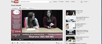


Final Cut Express was the most useful media tool we used as it helped us to create our film and trailer. For our trailer we wanted to create banners that would go across the side and bottom of the clip so that it would look like a real QVC style advert. We accomplished this by creating them on Photoshop Elements, importing them onto Final Cut and adding a scrolling text along the bottom and static text at the side. This allowed us to practice our editing skills before tackling our actual film so that we would be more experienced for it and be able to develop our skills. One big thing that featured in both our advert and film was the rewinding of certain clips, we practiced this in our trailer changing the speed to make the clip play backwards. I edited almost the entirety of our trailer which allowed me to gain substantial practice and experience in editing and how to create desired effects that we would later feature in our finished film. A problem I encountered was that not all of the footage was continuous and therefore the positioning was different, I had to alter this by using framewire to change their position to match the rest of the clips. We applied transitions to our film to help it run smoother and chose a fade in because we felt it worked best with the tone of our film. We had to adjust the brightness and colour of our film in certain places as when we looked at it parts were slightly yellow, we added filters to achieve this. Also in parts the music was too loud as it drowned out the speech, so we had to adjust the volume on the music to make it lower and make the voice overs louder.

I used Garageband and Final Cut to create our radiotrailer and extracted specific sound bites from our film to create an idea of what our film is about. I used important points from our film and used the zoom recorder to record a voice over for the beginning and end of the trailer that would introduce the film and let the audience know about its release. I edited the sound bites together to create a smooth running advert and placed the rewinding sound effect from our film in the middle. I then added the music from our film and placed it over the top of the audio to finish it off.
We took photos of our cast using a camera and put them on the Mac, we then used Photoshop to create our poster. We used the lasso tool to cut out the images of our cast and the image of a TV, we then placed the image of our female lead in the TV to create a comedic effect and placed the image of our male lead next to this. We had to re-position the images and enlarge them to make the poster flow more smoothly since we didn't feel it looked right at first, the images looked like cut outs which made it look amateur. We added our title design, logo, certificate rating, distributor, college name, website name and poster credits to make it look official. Finally we featured the names of the cast above their images in the same font to that of our title which tied in the poster nicely.


Tuesday, 17 April 2012
Poster Ideas
I came up with four ideas for what our poster could look like, I sketched them out first and then scanned them into the computer. I decided that it would be better to use posters that featured pictures of our characters and text so that the audience could get a better idea of what our film is like and the themes it contains. My ideas are similar to those used in posters for mainstream rom-coms and therefore would target a larger audience. I have given brief descriptions and images of my ideas below; they will be shown to the group and together we will decide which to use, we may use someone else's idea or take elements from several posters to create the best representation of our film.

I used the classic style of split section rom-com posters here to create a look that will remind people of the rom-com genre and attract them to the film. This will let people know what type of audience our film should be expecting and will help to create a fan base and following. Instead of using a coloured panel to split up the images of the actors as is traditionally done, I used the image of our remote with the title, "Rewind," spelled out using the buttons on the remote. I did this because I wanted to prominently feature the remote in my poster and I thought that this would be an interesting and effective way to do it. It helps to draw attention to the title and plot of our film without overshadowing the images of the actors as they are featured prominently. I positioned the actors names at the side of their images with their first names being shown in the correct order whilst their surnames are shown backwards to tie in with the themes of our film and again draw attention to the 'rewind' concept. I positioned the characters so that Emma is above Jack which shows that she has the power in their relationship and Jack is staring up at Emma to show that he is more into her than she is him.


I used the classic style of split section rom-com posters here to create a look that will remind people of the rom-com genre and attract them to the film. This will let people know what type of audience our film should be expecting and will help to create a fan base and following. Instead of using a coloured panel to split up the images of the actors as is traditionally done, I used the image of our remote with the title, "Rewind," spelled out using the buttons on the remote. I did this because I wanted to prominently feature the remote in my poster and I thought that this would be an interesting and effective way to do it. It helps to draw attention to the title and plot of our film without overshadowing the images of the actors as they are featured prominently. I positioned the actors names at the side of their images with their first names being shown in the correct order whilst their surnames are shown backwards to tie in with the themes of our film and again draw attention to the 'rewind' concept. I positioned the characters so that Emma is above Jack which shows that she has the power in their relationship and Jack is staring up at Emma to show that he is more into her than she is him.

In this poster I used the classic poster pose of 'the lean', this is used in many rom-com films to let the audience know what genre the film is and ours is no different. In the poster Jack is falling and reaching for his rewind remote while Emma is trying to stop him from falling. This again shows that she has the power as she is shown standing higher than him and is trying to save him, this is a subversion of the usual stereotype of the man saving the woman which shows that our film is interesting and different. Again the remote is featured yet this time it is not as obvious as this poster focuses more on the characters and the mistakes that they make. The actors names are featured to the side of their images and the credits are shown underneath. The title is placed at the top of the poster and has a border around it that makes it stand out and again it looks slightly remote-like. The first two letters of the title are backwards to symbolise the rewinding action that occurs throughout the film while the rest of the letters are the correct way round to show the order that occurs after the rewind. WIND is smaller than the first two letters but is underlined so that the audience know that this is the important part of the film.

In this poster I wanted to focus more on the reason Jack needs the remote- because he isn't confident with girls and therefore cannot maintain a good relationship with Emma without the use of the remote. I therefore drew them in a situation where the remote may be needed; on a bad date. The remote is shown in Jack's hand as he holds his head in his other hand to signal that the date is not going well as he has made a mistake. He is clearly about to rewind the date and this tells our audience the basic gist of our film. Emma is shown staring away from Jack clearly in a mood with him or bored of the date, she is positioned in a very cold, guarded pose and doesn't seem to want to be there, this gives the audience a view of what our characters may be like. The names of the actors are shown above their images with their first names presented in a larger font and in all capitals whilst their surnames are smaller and in lower case. I did this because I wanted to experiment in all the posters with text styles and sizes. The title is shown at the very top of the page with RE again being bigger than WIND as in the last poster.

In this poster I tried not to focus on the female character, just the character of Jack and the problems he faces. I showed the remote in his back pocket to show that he is the one in need and possession of it. I featured a couch with wine spilled on it and Jack facing away from the front with his hands placed on his head. He is clearly disappointed and worried about his mistake and is looking for a way to fix it. I thought that using no characters faces and making the poster look less complicated made it look more interesting and stylish. I think this poster looks the most professional and realistic and would work well to advertise our film. I placed the actors names beneath the title, which is the same as the previous two posters, and wrote their first names in bold to emphasise them. In this poster I included a tagline in the form of a rhetorical question to make the audience think and question the concept of the film. This would make the film more memorable and interest the audience so that they would want to see it.
Poster Research
To come up with my poster design I looked at certain film posters that have already been used to advertise the rom-com genre. I looked at key features in the posters and what we can take from them to use in our poster. I specifically looked for features that stood out to me or made it obvious what the poster was advertising. I chose a selection of films to look at which I thought were appealing, they are shown below.


I chose these posters because I wanted to look at posters which featured these kinds of formats; this is because I believe either of these could work well for our film if adapted a little to fit with our themes. I chose two of each different format for variety. All of these films feature the same genre as our film which means that they are quite fun and upbeat since the style of film matches this tone.
Images/Photos
The first two posters feature the same types of images; these are of smiling happy people staring away from the audience. The second two feature what is known as "the lean," this shows a couple leaning on each other either for support or in an embrace. I think that either of these would work well for our film and create a professional look that would give the audience an idea of what our film is about. The "Something's Gotta Give," poster shows the characters in panels separated by a white strip containing coloured text. They are both smiling and staring into the distance and Jack Nicholson is wearing black sunglasses which suggests that he is more guarded than Diane Kruger's character; it also suggests that he is hiding something which is true for his character. The poster for "The Holiday," is practically the same as the latter except that it features two people in each panel instead of one.The same smiling faces staring away from the shot are used as if to signify their happiness and they are displaying loving looks. This poster advertises the film well as it is generally just a film about love and finding happiness; the images reflect this. The "Housesitter," poster shows Steve Martin looking shocked and bewildered as Goldie Hawn leans on him and smiles manically at the camera; he looks as though he is backing away from her and doesn't want her to be around while she is seemingly oblivious to this fact. They do not appear to be in love or on the same wavelength as the other couples do. The "Forces of Nature," poster shows Sandra Bullock leaning on Ben Affleck as if they are both falling and she is trying to hold him up or save him. They are both smiling at each other and we can see that rain is featured which ties in with the title as it is a force of nature. Both of the female leads in the last two posters are also grabbing the male leads by the collar area as if to show a sign of possession. The background in each poster is definitely not the focus as the film clearly concentrates on the relationship between the featured couple and therefore prominently shows them. The backgrounds for all the posters are blurred except for the "Housesitter," which features the house in the background as it is obviously a prominent framing device for the film, hence the name of the film. In "Something's Gotta Give" and "Housesitter," both Jack Nicholson and Goldie Hawn are wearing sunglasses which suggests that these characters are mysterious and have a secret- this is true to the plot of the films.
Colour themes
"Something's Gotta Give," uses blurred backgrounds that contrast with the hair or skin tone in order to make them stand out. This poster uses very simplistic colours that compliment the tone of the film and it's setting. The vibrant green behind Jack Nicholson helps to make his dark black sunglasses stand out as they give an insight into the nature of the character. The colours chosen could possibly be used to represent the characters personalities as the vibrant green shows that Nicholson's character is wild and bold while the cream colour used behind Keaton represents her being more calm and collected. The panel between their pictures is white which carries on the simplistic feel and the text is a mix of blacks and different shades of brown; simple colours that do not draw much attention away from the images of these veteran actors who will draw in viewers. The title is black so that it stands out more than the other text and the two lead actors names are the darkest shades of brown so that they will stand out too. The date and the names of the supporting cast are in black while the rest of the credits are in a light brown."The Holiday," features the same simplistic feel, even including the white panel in the middle although this time it features all black text which draws focus to the bold title. All of the text is in black except for the credits at the bottom of the poster which are white so that they stand out on a darker background. The characters are presented in darker colours, possibly because the film is set in winter and they wanted to get this point across to the audience as it ties in with the title which refers to physically going on a holiday and also the holiday of christmas. The characters are wearing dark colours and are set on dark backgrounds but their skin tones stand out as if to say that they are glowing because they are happy; this could be so that the audience understand that this is a happy film even though it is set at a bad point in the characters lives. "Housesitter," contains very vibrant colours that represent the bold and comedic direction the film takes. It is brash and the colours reflect this fact. The title of the film and the main actors names are displayed in hot pink which makes them stand out more than anything else; especially on the bright blue and black backgrounds they are shown on. This colour obviously represents the nature of Hawn's character as she is outspoken and feminine. The first tagline is in black and the second is in white to match the credits; these colours help to balance out the loud pink colour used, much like the characters balance each other out. The background colours are very vibrant and stand out, especially the lush green of the grass which helps to highlight the presence of the house in the background. The characters are also coloured very brightly so that they stand out against the background and Hawn wears hot pink sunglasses to tie in with the text colour. "Forces of Nature," features an uneventful background that is all green with white flecks that seem to symbolise the rain on the ground; this ties in with the nature theme. The rain is lightened so that it appears to be very white which makes it stand out. All of the text is white to fit with the running theme of green and white, however this means that it doesn't really stand out. The characters are the focus of this poster as they are the only part of the poster that steer away from the colour theme. They are displayed in deep, rich colours which possibly suggests that they are fighting nature instead of accepting it- the point of the film. Bullocks hair is a deep chestnut colour that is shown billowing in the wind to tie in with the nature theme again.
Text and Fonts
The texts and fonts used are all pretty simplistic and uncomplicated apart from that used in "Forces of Nature," which is slightly slanted and looks as if it is being blown by the wind used to represent nature. All of the text used for the titles is quite large and takes up a significant amount of space on the poster so that it is clearly visible to the audience. The "Something's Gotta Give," poster presents the names of the two main actors in a large clean cut font and uses only their first names, relying on the audience to recognise them from their photos. This poster is the only one to make the actors names as big as the title; this is probably because they are such big stars and will be an audience pull. The font is very laid back and calm which gives the impression of a feel-good film. "Housesitter" and "Forces of Nature," make the actors names appear significantly smaller than in the previous poster; they both use about the same size text as each other and only two actors names are used in both posters which shows that they are important to the film equally. The first uses quite squashed together and elongated letters which makes it look cramped; how Steve Martin feels in the film. "The Holiday" uses a smaller font for "the" suggesting that the part of the title they want to focus on is "Holiday". The letters seem to be different sizes and some are quite curly while others are blocky; this suggests that the characters are jumbled up. The actors names are presented at their smallest in this poster and are all the same size and colour; meaning they are all equally important to the film. The tag lines in each are way smaller than any of the other writing apart from the credits and the date is always featured in the credits but slightly larger than the other text.
Positioning/Composition
The first two posters feature basically the same composition with the title in the middle splitting up two images of the actors and the poster credits and release date at the bottom. The actors names are included in the white panels and the only difference between these two posters is that there is another white panel at the bottom of the "Something's Gotta Give" poster and not at the bottom of the "The Holiday" poster. The second two posters also are very similar in terms of composition as the actors names are shown at the top of the poster and the titles are shown about a third of the way up. Also the poster credits are featured under the title on both; the difference in text positioning is that the tag lines for the "Housesitter" poster are featured first beneath the actors names and then beneath the title whilst the "Forces of Nature" tag line is shown above the title. The actors in the first of these two are shown on the right side of the poster whilst on the second the positioning is flipped and they are featured on the left side.
How this relates to our film
These poster give good examples of how we can make our poster look professional and like a real romantic comedy. These give us an idea of how to present and create our poster as they give us an idea of what our poster could end up looking like. These would be interesting styles to follow as they feature the main characters which are usually the romantic leads and this is the same as our film; therefore we could present the images of our actors in similar poses to create a fun and vibrant poster such as the above that helps to represent the nature of our film. We can see from the posters what good positioning of text looks like and where we would put our credits and actors names. We can also see how to tie the themes of our film in with our poster as the posters for "Housesitter" and "The Holiday" do. We can take inspiration from these posters on how to create a memorable representation of our film that will attract our target audience.
The first two posters feature the same types of images; these are of smiling happy people staring away from the audience. The second two feature what is known as "the lean," this shows a couple leaning on each other either for support or in an embrace. I think that either of these would work well for our film and create a professional look that would give the audience an idea of what our film is about. The "Something's Gotta Give," poster shows the characters in panels separated by a white strip containing coloured text. They are both smiling and staring into the distance and Jack Nicholson is wearing black sunglasses which suggests that he is more guarded than Diane Kruger's character; it also suggests that he is hiding something which is true for his character. The poster for "The Holiday," is practically the same as the latter except that it features two people in each panel instead of one.The same smiling faces staring away from the shot are used as if to signify their happiness and they are displaying loving looks. This poster advertises the film well as it is generally just a film about love and finding happiness; the images reflect this. The "Housesitter," poster shows Steve Martin looking shocked and bewildered as Goldie Hawn leans on him and smiles manically at the camera; he looks as though he is backing away from her and doesn't want her to be around while she is seemingly oblivious to this fact. They do not appear to be in love or on the same wavelength as the other couples do. The "Forces of Nature," poster shows Sandra Bullock leaning on Ben Affleck as if they are both falling and she is trying to hold him up or save him. They are both smiling at each other and we can see that rain is featured which ties in with the title as it is a force of nature. Both of the female leads in the last two posters are also grabbing the male leads by the collar area as if to show a sign of possession. The background in each poster is definitely not the focus as the film clearly concentrates on the relationship between the featured couple and therefore prominently shows them. The backgrounds for all the posters are blurred except for the "Housesitter," which features the house in the background as it is obviously a prominent framing device for the film, hence the name of the film. In "Something's Gotta Give" and "Housesitter," both Jack Nicholson and Goldie Hawn are wearing sunglasses which suggests that these characters are mysterious and have a secret- this is true to the plot of the films.
Colour themes
"Something's Gotta Give," uses blurred backgrounds that contrast with the hair or skin tone in order to make them stand out. This poster uses very simplistic colours that compliment the tone of the film and it's setting. The vibrant green behind Jack Nicholson helps to make his dark black sunglasses stand out as they give an insight into the nature of the character. The colours chosen could possibly be used to represent the characters personalities as the vibrant green shows that Nicholson's character is wild and bold while the cream colour used behind Keaton represents her being more calm and collected. The panel between their pictures is white which carries on the simplistic feel and the text is a mix of blacks and different shades of brown; simple colours that do not draw much attention away from the images of these veteran actors who will draw in viewers. The title is black so that it stands out more than the other text and the two lead actors names are the darkest shades of brown so that they will stand out too. The date and the names of the supporting cast are in black while the rest of the credits are in a light brown."The Holiday," features the same simplistic feel, even including the white panel in the middle although this time it features all black text which draws focus to the bold title. All of the text is in black except for the credits at the bottom of the poster which are white so that they stand out on a darker background. The characters are presented in darker colours, possibly because the film is set in winter and they wanted to get this point across to the audience as it ties in with the title which refers to physically going on a holiday and also the holiday of christmas. The characters are wearing dark colours and are set on dark backgrounds but their skin tones stand out as if to say that they are glowing because they are happy; this could be so that the audience understand that this is a happy film even though it is set at a bad point in the characters lives. "Housesitter," contains very vibrant colours that represent the bold and comedic direction the film takes. It is brash and the colours reflect this fact. The title of the film and the main actors names are displayed in hot pink which makes them stand out more than anything else; especially on the bright blue and black backgrounds they are shown on. This colour obviously represents the nature of Hawn's character as she is outspoken and feminine. The first tagline is in black and the second is in white to match the credits; these colours help to balance out the loud pink colour used, much like the characters balance each other out. The background colours are very vibrant and stand out, especially the lush green of the grass which helps to highlight the presence of the house in the background. The characters are also coloured very brightly so that they stand out against the background and Hawn wears hot pink sunglasses to tie in with the text colour. "Forces of Nature," features an uneventful background that is all green with white flecks that seem to symbolise the rain on the ground; this ties in with the nature theme. The rain is lightened so that it appears to be very white which makes it stand out. All of the text is white to fit with the running theme of green and white, however this means that it doesn't really stand out. The characters are the focus of this poster as they are the only part of the poster that steer away from the colour theme. They are displayed in deep, rich colours which possibly suggests that they are fighting nature instead of accepting it- the point of the film. Bullocks hair is a deep chestnut colour that is shown billowing in the wind to tie in with the nature theme again.
Text and Fonts
The texts and fonts used are all pretty simplistic and uncomplicated apart from that used in "Forces of Nature," which is slightly slanted and looks as if it is being blown by the wind used to represent nature. All of the text used for the titles is quite large and takes up a significant amount of space on the poster so that it is clearly visible to the audience. The "Something's Gotta Give," poster presents the names of the two main actors in a large clean cut font and uses only their first names, relying on the audience to recognise them from their photos. This poster is the only one to make the actors names as big as the title; this is probably because they are such big stars and will be an audience pull. The font is very laid back and calm which gives the impression of a feel-good film. "Housesitter" and "Forces of Nature," make the actors names appear significantly smaller than in the previous poster; they both use about the same size text as each other and only two actors names are used in both posters which shows that they are important to the film equally. The first uses quite squashed together and elongated letters which makes it look cramped; how Steve Martin feels in the film. "The Holiday" uses a smaller font for "the" suggesting that the part of the title they want to focus on is "Holiday". The letters seem to be different sizes and some are quite curly while others are blocky; this suggests that the characters are jumbled up. The actors names are presented at their smallest in this poster and are all the same size and colour; meaning they are all equally important to the film. The tag lines in each are way smaller than any of the other writing apart from the credits and the date is always featured in the credits but slightly larger than the other text.
Positioning/Composition
The first two posters feature basically the same composition with the title in the middle splitting up two images of the actors and the poster credits and release date at the bottom. The actors names are included in the white panels and the only difference between these two posters is that there is another white panel at the bottom of the "Something's Gotta Give" poster and not at the bottom of the "The Holiday" poster. The second two posters also are very similar in terms of composition as the actors names are shown at the top of the poster and the titles are shown about a third of the way up. Also the poster credits are featured under the title on both; the difference in text positioning is that the tag lines for the "Housesitter" poster are featured first beneath the actors names and then beneath the title whilst the "Forces of Nature" tag line is shown above the title. The actors in the first of these two are shown on the right side of the poster whilst on the second the positioning is flipped and they are featured on the left side.
How this relates to our film
These poster give good examples of how we can make our poster look professional and like a real romantic comedy. These give us an idea of how to present and create our poster as they give us an idea of what our poster could end up looking like. These would be interesting styles to follow as they feature the main characters which are usually the romantic leads and this is the same as our film; therefore we could present the images of our actors in similar poses to create a fun and vibrant poster such as the above that helps to represent the nature of our film. We can see from the posters what good positioning of text looks like and where we would put our credits and actors names. We can also see how to tie the themes of our film in with our poster as the posters for "Housesitter" and "The Holiday" do. We can take inspiration from these posters on how to create a memorable representation of our film that will attract our target audience.
Sunday, 15 April 2012
Certificate Research
As part of my audience research I looked at what certificate would fit our film based on it's themes, content and how it would affect our audience. I looked on the British Board of Film Classification (BBFC) website to see what would be the most appropriate certificate for our film and what each certificates restrictions were. I only looked at the certificates that could possibly fit our film.

U - Universal - Suitable for all
"It is impossible to predict what might upset any particular child. But a 'U' film should be suitable for audiences aged four years and over. 'U' films should be set within a positive moral framework and should offer reassuring counterbalances to any violence, threat or horror. If a work is particularly suitable for a pre-school child to view alone, this will be indicated in the Consumer Advice."
Obviously there were many restrictions for this certificate but these are the ones that specifically apply to our film;


Our film includes one use of mild bad language, one use of mild violence, one scene featuring the consumption of alcohol and implied underlying themes of sex and sexual activity. We believe that even though most of the themes could place our film under a "Universal" rating, it would be inappropriate for young children as it features themes that are too mature for them and therefore it should have a "PG" rating.
U - Universal - Suitable for all
"It is impossible to predict what might upset any particular child. But a 'U' film should be suitable for audiences aged four years and over. 'U' films should be set within a positive moral framework and should offer reassuring counterbalances to any violence, threat or horror. If a work is particularly suitable for a pre-school child to view alone, this will be indicated in the Consumer Advice."
Obviously there were many restrictions for this certificate but these are the ones that specifically apply to our film;
- Language -
Infrequent use only of very mild bad language. (We use the word "crap" once) - Sex -
Mild sexual behaviour (for example, kissing) and references only (for example, to ‘making love’). (although none of this content is featured in our film, it is implied that this is where the characters are heading. Our film contains mature themes that may affect how children think and behave) - Violence -
Mild violence only. Occasional mild threat or menace only.(One slap is featured) - Imitable Behaviour -
No potentially dangerous behaviour which young children are likely to copy. No emphasis on realistic or easily accessible weapons. (Although the film does not contain weapons it does show the characters drinking alcohol which children could try and copy)
PG - Parental Guidance - General viewing, but some scenes may be unsuitable for young children
"Unaccompanied children of any age may watch. A ‘PG’ film should not disturb a child aged around eight or older. However, parents are advised to consider whether the content may upset younger or more sensitive children." - Language -
Mild bad language only. - Sex -
Sexual activity may be implied, but should be discreet and infrequent. Mild sex references and innuendo only. - Violence -
Moderate violence, without detail, may be allowed, if justified by its context (for example, history, comedy or fantasy). - Imitable Behaviour -
No detail of potentially dangerous behaviour which young children are likely to copy. No glamorisation of realistic or easily accessible weapons.
12A/12 - Suitable for 12 years and over
"Exactly the same criteria are used to classify works at ‘12A’ and ‘12’. These categories are awarded where the material is suitable, in general, only for those aged 12 and over. Works classified at these categories may upset children under 12 or contain material which many parents will find unsuitable for them. The ‘12A’ category exists only for cinema films. No one younger than 12 may see a ‘12A’ film in a cinema unless accompanied by an adult, and films classified ‘12A’ are not recommended for a child below 12. An adult may take a younger child if, in their judgement, the film is suitable for that particular child. In such circumstances, responsibility for allowing a child under 12 to view lies with the accompanying adult."
"Exactly the same criteria are used to classify works at ‘12A’ and ‘12’. These categories are awarded where the material is suitable, in general, only for those aged 12 and over. Works classified at these categories may upset children under 12 or contain material which many parents will find unsuitable for them. The ‘12A’ category exists only for cinema films. No one younger than 12 may see a ‘12A’ film in a cinema unless accompanied by an adult, and films classified ‘12A’ are not recommended for a child below 12. An adult may take a younger child if, in their judgement, the film is suitable for that particular child. In such circumstances, responsibility for allowing a child under 12 to view lies with the accompanying adult."
- Language -
Moderate language is allowed. The use of strong language (for example, ‘fuck’) must be infrequent. - Sex -
Sexual activity may be briefly and discreetly portrayed. Sex references should not go beyond what is suitable for young teenagers. Frequent crude references are unlikely to be acceptable. - Violence -
Moderate violence is allowed but should not dwell on detail. There should be no emphasis on injuries or blood, but occasional gory moments may be permitted if justified by the context. Sexual violence may only be implied or briefly and discreetly indicated, and must have a strong contextual justification. - Imitable Behaviour -
Dangerous behaviour (for example, hanging, suicide and self-harming) should not dwell on detail which could be copied, or appear pain or harm free. Easily accessible weapons should not be glamorised.
Our film includes one use of mild bad language, one use of mild violence, one scene featuring the consumption of alcohol and implied underlying themes of sex and sexual activity. We believe that even though most of the themes could place our film under a "Universal" rating, it would be inappropriate for young children as it features themes that are too mature for them and therefore it should have a "PG" rating.
Thursday, 29 March 2012
Radio Trailer Script
We created a radio trailer on the sound editor, Garage Band and Final Cut Express, using sound bites and music from our film, sound effects, plus an additional voiceover. This combines the humour and plot of our film and also give promotion. We created two possible scripts and made each. Here are the two scripts:
Script One - The longer script
Music starts:
Jack: Okay Jack, it's all good, don't make it obvious. Reach it over there, nice and easy, this isn't the arm olympics. The old reach around.
*SLAP* (sound effect)
Emma: What was that?
Jack: My name is Jack, I'm nineteen years old and I've never had a real girlfriend. This is the tenth time I've had my first date with Emma, which doesn't make any sense to you at all, but let me explain.
*rewinding noise*
Voiceover: Rewind, coming soon to a cinema near you.
Script Two - The abrupt script
Music starts:
Jack: Okay Jack, it's all good, don't make it obvious. Reach it over there, nice and easy, this isn't the arm olympics. The old reach around.
*SLAP sound effect*
Emma: What was that?
Voiceover: If you had the power to rewind time, would you?
*rewinding noise*
Voiceover: Rewind, coming soon to a cinema near you.
Here are both versions of our radio trailer:

Script One - The longer script
Music starts:
Jack: Okay Jack, it's all good, don't make it obvious. Reach it over there, nice and easy, this isn't the arm olympics. The old reach around.
*SLAP* (sound effect)
Emma: What was that?
Jack: My name is Jack, I'm nineteen years old and I've never had a real girlfriend. This is the tenth time I've had my first date with Emma, which doesn't make any sense to you at all, but let me explain.
*rewinding noise*
Voiceover: Rewind, coming soon to a cinema near you.
Script Two - The abrupt script
Music starts:
Jack: Okay Jack, it's all good, don't make it obvious. Reach it over there, nice and easy, this isn't the arm olympics. The old reach around.
*SLAP sound effect*
Emma: What was that?
Voiceover: If you had the power to rewind time, would you?
*rewinding noise*
Voiceover: Rewind, coming soon to a cinema near you.
Here are both versions of our radio trailer:
In the end we chose to use the second edit, simply because it featured a tagline which made the radio trailer more catchy and memorable. The radio trailer is a fitting advertisement for our film. It has element of comedy which the audience should pick up on and understand.

Our Poster
When it came to making our poster, we desided to go with Joe's idea. His research into Romantic Comedy posters found that many posters have a similar format, including original photos of the main love interests in the film. Here is our step by step process as we created our poster.
Step One - Getting Original Photography
First, we took photos of our actors, a television screen, and our remote control.
(ADD PHOTOS)


Step Two - A Draft
- Then we uploaded our photos to Photoshop Elements. We used a lasso tool to cut around each character, removing the background. We added each to a separate layer so we could alter them each individually.

- We added the title "Rewind" that Amy created previously.

- We found a copyright free image of a static TV and added it behind Jen so she appeared to be trapped in the TV as if controlled by Joe.
- We added the cast names to the top of the poster, above their corresponding actor, using the font we also used on our film credits called "Matroyoshka".
- We added poster credits, also known as a "Billing Block" underneath the title.
Here is the first initial poster Joe created in a sketch format and a photoshop format.


Step 3 - Making improvements
- We were generally happy with the poster but wanted to make a few improvements to the usage of space and composition.
- Firstly, we moved the main features of our poster, the actors photos. We made them much larger and more centre. It made them the most eye catching feature.
- We made the title larger and engaged it more within the poster, integrating it with the photograph of Joe.
- We added a web address below the poster credits to make the poster more multi-media.
- We made the cast names larger and altered their positon to make them more interesting.
- We added a certificate rating, our production logo (inverted), our college logo and a suggested distribution company to give the poster a more realistic look.

We think our poster looks fun and professional. It has a simple idea and mirrors the theme/genre of our film with elements of comedy plus a "Man V.s Female" vibe. The colour scheme is chilled and friendly. It is eye-catching because it features large images and text.
Friday, 23 March 2012
Audience Research - Feedback
To get a reception from our traget audience, we posted a rough version of the final film onto Youtube and uploaded it to Facebook on our three profiles. We each have friends within our target audience range and hoped they would comment with some suggested improvements before we did our final edits to the film. But also to find out if the film has a generally positive reception from the people who watched it. Here are the improvements we are expecting to hear;

Results


- Title Sequence - needs more clips in the blank areas.
- Music - needs more music throughout, in particular the title sequence.
- Sound Effects - TV Background, needs to be louder.
Here is the rough edit we have uploaded. After we have enough results, we will made the ammendments to our film before realeasing a final edit.

Results


We didn't receive all the expected results. Some of the suggested improvement highlighted aspects we really liked and didn't want to change but we did use the results to make some improvements.
- Amended spelling errors.
- Made the music in the delivery scene more smooth, by re-added a section we had previously cut.
- Added music to the title sequence and credits.
Thursday, 2 February 2012
Genre Research
Romance
Romance films contain strong themes of love and sex and the traditional values that link with these; such as marriage, courtship and pregnancy. They usually focus on one couple who go through several trials to be together and usually prevail in the end. However, one of the most famous products of the romance genre is Shakespeare's, 'Romeo and Juliet', in which the couple do not prevail but end up dying. These types of films usually either depict someone looking for love and eventually finding it or show the troubles that a couple face whether in marriage or through disapproval of their relationship. Usual themes that threaten the protagonist's relationship are finances, illness, discrimination, psychological restraints, family that threaten to break their union of love, tensions, temptations and incompatibility. Most of these films seek to prove the idea of love yet there are some that stand to question it. This genre seeks to allow people to escape into a fantasy world where everything is as ideal as they wish it would be and there is almost always a happy ending. Usually these films revolve around traditional couples, however there are some romance films that feature same-sex couples.
Subgenres
There are four main subgenres of the romance genre, these are:
Romantic films often explore the essential themes of love at first sight, young with older love, unrequited love, obsessive love, sentimental love, spiritual love, forbidden love, sexual and passionate love, sacrificial love, explosive and destructive love, and tragic love. Here are examples of films that contain some of these themes:


Romance films contain strong themes of love and sex and the traditional values that link with these; such as marriage, courtship and pregnancy. They usually focus on one couple who go through several trials to be together and usually prevail in the end. However, one of the most famous products of the romance genre is Shakespeare's, 'Romeo and Juliet', in which the couple do not prevail but end up dying. These types of films usually either depict someone looking for love and eventually finding it or show the troubles that a couple face whether in marriage or through disapproval of their relationship. Usual themes that threaten the protagonist's relationship are finances, illness, discrimination, psychological restraints, family that threaten to break their union of love, tensions, temptations and incompatibility. Most of these films seek to prove the idea of love yet there are some that stand to question it. This genre seeks to allow people to escape into a fantasy world where everything is as ideal as they wish it would be and there is almost always a happy ending. Usually these films revolve around traditional couples, however there are some romance films that feature same-sex couples.
Subgenres
There are four main subgenres of the romance genre, these are:
- Romantic Drama- This is the quintessential romantic film and is probably what everyone imagines when they first think of this genre. It places greater emphasis on sex and the figures of the lovers than subgenres such as rom-coms do. There is also less use here of the trusted confidant device. These films are typically more emotional and contain more dramatic incidents; the music used often reflects this well. The conclusion of a romantic drama typically does not indicate whether a marriage will take place or even if the couple will stay together. A good example of this is, 'The Bridges of Madison County'.
- Chick Flick- This is a term often associated with romance films as many are specifically targeted to a female audience. Although many romance films are targeted at women because they feature the central theme of romance, the chick flick doesn't necessarily contain this theme; there are some that just focus on a friendship between women which men would assumably not be interested in, hence the term. But there are a great deal of chick flicks that contain romantic themes, such as, 'Dirty Dancing' or 'Dear John'.
- Romantic Comedies- These are usually light-hearted films with humorous plot-lines that contain ideals such as, love overcomes all obstacles. In these films the obstacles keeping the couple apart are usually humorous or odd. Humour in these films can include sexual humour, verbal, witty comedy or situational humour as opposed to comedy such as slapstick. Films in this genre include, 'Love Actually', 'When Harry Met Sally' or 'The Holiday'.
- Romantic Thriller- A genre of film that contains a storyline which combines elements of the romance and thriller genre. These films usually revolve around dangerous or eerie circumstances that keep the couple apart. Films in this genre include, 'The Adjustment Bureau', 'Mr and Mrs Smith' or 'Wicker Park'.
- Romantic Epic- These are romance films done on a larger scale. They are usually set in a historical setting. The romance itself is usually portrayed in a counterpoint to war, conflict or political events in the background of the story. In these films, the romance and the main character's relationships are the centerpiece of the story, rather than a subplot. A good example of this type of film is, 'Gone With the Wind'.
Romantic films often explore the essential themes of love at first sight, young with older love, unrequited love, obsessive love, sentimental love, spiritual love, forbidden love, sexual and passionate love, sacrificial love, explosive and destructive love, and tragic love. Here are examples of films that contain some of these themes:

- Harold and Maude- Harold and Maude is about a young man forming a relationship with a much older woman; therefore it features the themes of young with older love and forbidden love as the boys family do not approve of the relationship. While this film is a romance, it also contains elements of dark comedy.

- Romeo + Juliet- A modern take on the Shakespeare novel; it tells the classic love story of two lovers forbidden to be together by their disapproving families. It features the themes of love at first sight, forbidden love, sexual and passionate love and tragic love due to the lovers both dying in the end.

- Mr. and Mrs. Smith- This is a film about a couple who keep secrets from each other that eventually tear them apart; however the film goes on to show how they are brought back together because they love each other and are both under threat. The film features elements of love at first sight, sexual and passionate love and explosive and destructive love.
Thursday, 26 January 2012
Viral Advert
A viral advert would really help to boost our films popularity and promotion as it would reach a wider variety of people and would probably spread faster than a television advert or an advert shown in the cinema. The idea of creating a fake advert for the remote used in the film would draw people in and fascinate them; some of them may think the advert is real and so it may cause controversy and therefore garner more publicity and be broadcast on television shows. If a ploy like this is used to gain attention it usually means that more people will go to see the film so that they can know what the joke was in the viral advert.
Roles:
Actors: Amy Bissell and Jade Brammah
Director: Jen Penaluna
Prop and set design: Joe Marshall
Behind the scenes: Jen Penaluna
Editing: Jade Brammah and Amy Bissell
Tuesday, 29 November 2011
Costumes
Jack's Costumes:
Jack needed to have three costumes as he is featured in the film on three different days. He needed a quite casual outfit for the bus stop scene but it needed to be fitting for the weather as the scene will take place outside and we want the scenario to seem realistic. We needed a casual outfit for indoors in the scene where he first finds the remote, orders it and recieves it; this outfit could even be pajamas or just something really laid back to show that he has just been lounging around the house. And finally we needed a smarter but still down to earth outfit for when he goes on his date with Emma as he wants to make a good impression and look nice for her. Jacks overall style is quite laid back, he basically likes to wear jeans and T-shirts all the time and doesn't particularly dress out of the ordinary. His hair is not styled and he does not need any make up or special effects. The costumes that we decided on for him are as follows:
Bus stop outfit:
Jack needed to have three costumes as he is featured in the film on three different days. He needed a quite casual outfit for the bus stop scene but it needed to be fitting for the weather as the scene will take place outside and we want the scenario to seem realistic. We needed a casual outfit for indoors in the scene where he first finds the remote, orders it and recieves it; this outfit could even be pajamas or just something really laid back to show that he has just been lounging around the house. And finally we needed a smarter but still down to earth outfit for when he goes on his date with Emma as he wants to make a good impression and look nice for her. Jacks overall style is quite laid back, he basically likes to wear jeans and T-shirts all the time and doesn't particularly dress out of the ordinary. His hair is not styled and he does not need any make up or special effects. The costumes that we decided on for him are as follows:
Bus stop outfit:

Casual outfit:

Date outfit:

I think we have created the desired effect and shown off Jack's personality through his costumes, he is meant to look like any ordinary man of his age and i think this is achieved; this in turn will make the film more believable.
Emma's Costumes:
Emma also needs more than one outfit as she is featured in the bus stop scene and the date part of the film. She needed an outfit similar to the nature of Jack's in the bus stop scene as she needed to look quite casual yet dressed appropriately for the weather. For the date part she is supposed to be making a good impression but also reflecting her personality through the clothes she is wearing; therefore we thought that she should either be wearing a simple skirt and T-shirt or jeans and a smart top to show that while she wants to look nice for him, she is also showing off her down to earth personality by not wearing flashy clothes to grab his attention; she wants to create an impression with her personality rather than her clothes. She generally also has quite a casual style that reflects her personality and shows what type of person she is; she likes to wear jeans, T-shirts and other simple items of clothing such as cardigans. Her hair is long and not particularly styled as she would prefer to show off her true nature than change herself to please other people. The costumes that we decided on for her are as follows:
Bus stop outfit:
Date outfit:
I believe the costumes that we have used for Emma work well and echo how we want her to appear to the audience. She looks down to earth and genuine; like she is a nice person which is how we intend the character to be.
Screen Test
We used a TV studio to film our screen test and created a small section of a script to set the conversation between the actors off; it was literally a basic script that was a few lines long and then we tried using improvisation to see how natural the actors looked on screen, so that it didn't look fake or forced. We decided that the prospective actresses should encounter a date like situation similar to the film in which they invited Joe in and sat down to have a chat with him and explore how well they got on. This idea worked quite well as it mimicked our film and gave us a good picture of how our film might look in terms of acting.
Jen and Joe
Jen and Joe had the awkwardness that we needed in our film, they looked good together and it was believable that they could be in this situation and that they could be these characters. I also think that Jen looks more like an Emma than me and that I would not be able to give the desired effect in terms of her character as Jen is more down to earth and rooted than I am. They looked as if they really were in a first date situation and as the clip progressed their chemistry and conversation began to flow; yes they had awkward moments but they seemed to click and get on well. I think it looks as if they are developing their relationship and this is what we really need. They seem happy in each others company and look comfortable together towards the end. All in all, they give off the desired effect we want to produce with Jack and Emma as they have the right amount of friendship and distance; they seem similar but yet so different.
Me and Joe
With me and Joe, things seemed more friendly, as if we had known each other a while. We didn't have as many awkward moments but at the same time we didn't look comfortable with each other. We seemed as if there could be nothing more than friendship between us. I don't think I would fit the part well as I am quite a jokey, loud person and this is not what we want Emma to be. I don't think that me and Joe looked physically right together either, he definitely suited Jen better on screen. It didn't really seem as if we were on a first date either which is the main staple that we need for our film; for it to seem like a date situation. It looked as though Joe was just coming round for tea with a friend or something which is bad if we want it to seem as though these two belong together despite their differences. Me and Joe seemed too similar on screen to carry off the intended contrasts between Emma and Jack as one is meant to be a joker and talk too much while the other is meant to be more quiet and level headed; I therefore do not fit the criteria for the part. We both had our arms crossed at some point in the clip which showed that we weren't as comfortable with each other as the characters are meant to be. Overall the chemistry just wasn't right and we decided that it would be better if Jen acted as Emma in our film as her and Joe are a better match.
Monday, 28 November 2011
Title Sequence Research
For our title sequence I wanted to try a stop motion idea but thinking that this idea needed something to fall back on I decided to find a different type of title sequence that was similar to my original idea and that could work for our film and draw inspiration from a clip that we could take ideas from. I thought that seeing as our film is supposed to be upbeat and different, that it should feature quite quirky and happy titles. If we could use rewinding sections in our sequence it would be good but there are not a lot of title sequences that use this that I can take inspiration from, so I instead decided to look at the nature of our title sequence. I wanted our title sequence to reflect the technical aspect of our film and thought that it could possibly link to one of our viral adverts.

Enter The Void

This title sequence features a lot of different fonts that all flash up in a quick order one after the other, each different font represents a different part of the title sequence which is what I originally wanted to do in my stop motion sequence by writing each part on a separate piece of paper. The sequence is very flashy and in your face and sticks in your mind, if we did the Japanese style viral then this type of sequence would link in very well with it. It seems like a very modern sequence to me as it seems very computerized, it also seems really sped up which could work well for our film as we want to give the image of either time rewinding or fast forwarding in quick motion. Since our film will contain rather modern themes such as the high tech remote and a computer, it would be good if our title sequence could reflect this and the sequence for, Enter The Void shows modernisation well. In a way this sequence is a lot like my stop motion idea but in a more modern form. It will stick in the audiences mind and let them know that this is not just any other boring film, it will get them excited and hyped up. Our titles wouldn't need to be as long as this but we could definitely do something similar on a mac.
Being Erica TV Series
If we wanted to create a more human title sequence, we could do something quirky like the opening to, Being Erica. In the sequence, the title character opens the door to her life and looks at all the different doors that represent the different chapters in her past; she even enters one before looking back on all the roles she has once played. It would be good if we could create a sequence similar to this as it is definitely very different and interesting and in ours we could show Jack literally looking back on all the mistakes he has made and wishing he could have erased them and then this would lead onto the point of our film in which he finally gets a remote that can allow him to achieve this wish. In the show, Being Erica, the character actually gets to go back in time and has the chance to change the things she regrets; this is similar to the point of our film which is why a similar title sequence could work too. This sequence is very upbeat and makes you feel happy which would let the audience know that this is going to be a comedy and a cheerful film and not a drama. It is also very interesting and makes you want to learn more about the series; as it would make you want to see our film. It would be a memorable title sequence and it would be something that the audience could relate to as everyone at some point has wished that they could change a mistake they have made. I think it would fit well in our film and would compliment the plot well.
What we could take from these
I think that if we combined the two ideas we could make an effective title sequence, we could use the idea of the doors representing the mistakes in Jacks past like from the Being Erica title sequence but on each door we could have a different font or colour, and towards the end of the sequence the camera could show each door in quick succession to speed up the sequence and make it seem like Jack has made a lot of mistakes. This in turn would echo the fast pace of the Enter The Void sequence. I think it would be good to try this idea as it would definitely link in well with the themes and ideas of our film.
Stop Motion Title Sequence Research
For our title sequence I wanted to try using a version of our logo to expand on and create into the actual titles, I thought that using the scrunched up piece of paper with our company name on it instead of creating a whole separate title sequence could save us time and look quite sleek and professional. I had the idea that the piece of paper could crumple and then flatten again so that it would seem as if the person writing the titles kept making mistakes and starting again. This is basically the idea of our film which I thought could tie it nicely in. The writer keeps making mistakes and erasing them; effectively starting on a clean slate and every time Jack does this in the film he is also starting on a clean slate. The titles would sort of echo the point of the film and subliminally let the audience know what the film is about. This idea could also give new meaning to our name, 'Blank Page Productions', as the person keeps starting on a blank page, this shows that our name does not just mean that we are out of ideas or anything, but that we keep coming up with better and new ones. To create this sequence, I would basically film a piece of crumpled paper being flattened and crumpled again and use this over and over, each time adding a different piece of text from the titles.
I looked at a stop motion clip on Youtube that uses post it notes to gather ideas.
I looked at a stop motion clip on Youtube that uses post it notes to gather ideas.
I thought that this clip was very well done and interesting and it keeps you wanting to watch it as it is not like any ordinary clip as it features something that you can marvel at and keep fixated on. The clip does feature a person which my idea wouldn't however I could incorporate my hand into the scene to give it a human touch. The fact that this clip involves paper and is done so well means that my idea could be carried off if I found the right way to shoot it. This clip is more complex than I intend mine to be, but it reflects the chaos the person has of achieving his deadline just as mine would reflect the themes in our film. I think overall that this clip shows that stop motion can be done well and look professional just as I would like my idea to.
Thursday, 24 November 2011


Subscribe to:
Posts (Atom)