Wednesday, 18 April 2012

Amy Bissell - Critical Evaluation - Question 4

Q4. How did you use new media technologies in the construction and research, planning and evaluation stages?
A: Technology has been the most important feature of my product this year. From the initial research to the final edit of my five-minute film, new technology has played a vital role in my work. Firstly, I have used the Internet, using a Blog to exhibit my work and research in a creative format. My blog had multi-media, featuring text, external link, a collection of borrowed and original photos and even videos, both from YouTube and of my own creation. The Internet was vital for my research, in particular to find examples viral advertising, where I found many examples such as images and interactive website.  The Internet also provided opportunities from audience research, as I used the social network site Facebook to gain information through a digital questionnaire via Chat. It enabled me to get a broad audience feedback.  I did however encounter problems when uploading my own video’s to YouTube as our college provides only a restricted bandwidth for uploading, but after consulting my tutor the problem was soon fixed. I also used a variety of software on Mac computers throughout my project. I used Celtx to write the script, Word to create a shooting script, Photoshop Elements to create a banner and Production Company Logo, and ArtTextLite and Paint to create our title. We also used websites like eBay, as we created a fake page advertising the prop remote used in film. Photoshop Elements allowed me to use a range of features to edit different layers, much like Final Cut but for images. I could create a background and build onto it with different layers, like imported images, text layers and then clip art. For sound editing in our film, we used a combination of Garage Band and Final Cut together to create an interesting effect on the sound effect of rewind me used to make it sound echoed, and to compile the sounds effects, music and soundbites effectively.


New technology was a big part of the production stage of my film with the equipment used. We filmed using a high definition camera, which enabled us to create a more crisp image.  I also gained experience using a Zoom Recorder to create original audio for a voiceover. These details helped to create a more technical and advance final product than in my Foundation year. I was however forced to change elements of my film due to restrictions caused by technology, in particular with focus. Our camera uses a spinning ring to focus, rather than a linear ring, which made it very difficult to focus on objects very close to the camera and also when pull focusing. I was forced to remove a pull focus shot from our film and replace it with a simple medium shot of two characters instead. I also found that the camera and tripod restricted me from filming in a confided area, in particular when I was filming in a bathroom that had little space to fit the camera plus various mirrors. To overcome this, I included two hand held shots rather than using the tripod.

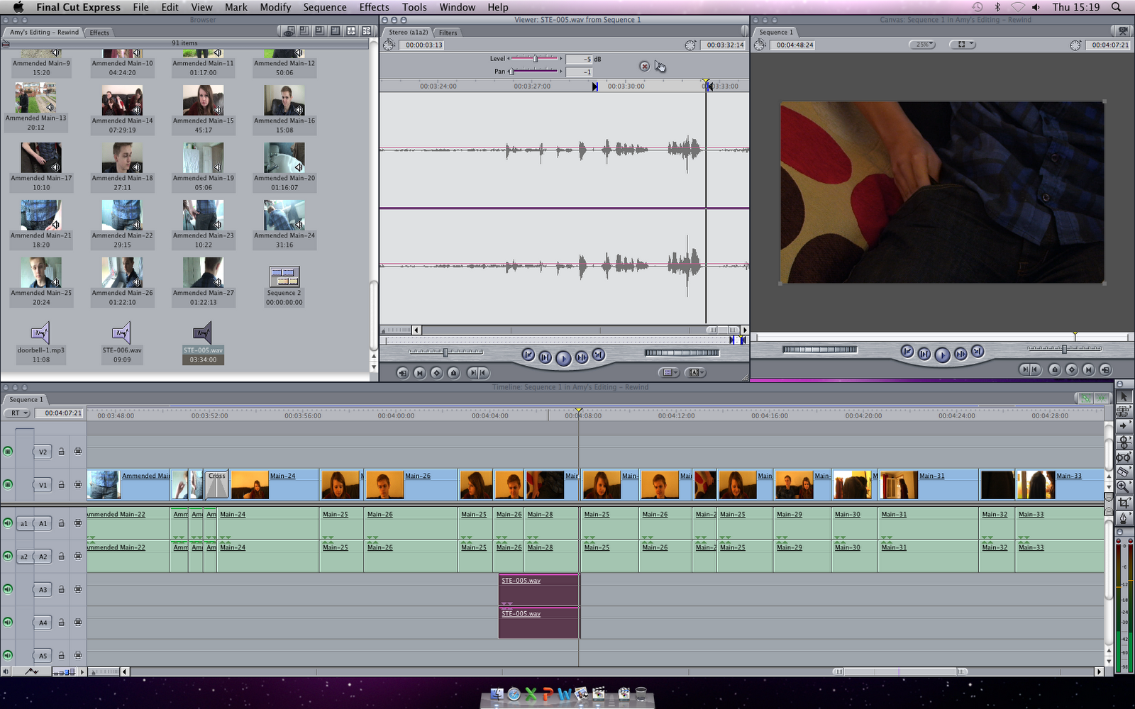
To edit the film, we used Mac computers and various software such as Final Cut Express to edit footage and Photoshop Elements for poster design. I also used other software such as using Celtx to create a formatted script. To show creativity, we created our viral advertisement idea to be featured briefly in our film itself. We used Final Cut Express to edit our advert together. I created images for the advert on Photoshop elements which was imported onto Final Cut, where we also added moving text and copyright free sounds from a website. It combined all our new skills together and allowed us to experiment with the features of Final Cut Express before editing our final product, such as altering speed and reversing the images to play backward. In particular, I did the majority of editing in the group on our final product, which involved trimming shots, importing voiceover audio and copyright free sound effects, applying various transition and reversing visuals and audio. I was also responsible for altering the colour and brightness of several shots and also adjusting audio levels. Here is the step by step process I had to complete for each shot to edit the colour and overall brightness of the shot, (Click to Enlarge). First I selected the shot and clicked the filters tab. I then dragged in a Brightness and Contrast filter and adjusted the levels of each. Then I added a colour filter and added more white and blue to countert the overly-yellow image. You see the end result on the final photo.


I was also had to alter the audio levels of some shots, for example when adding our voiceover recordings. Here, I altered the Level from 0db to -5db and the Pan from 0 to -1, making the recording quieter.



Some shots were also adjusted using the framewire feature to edit their composition on screen. Below is an example, while I was creating the title sequence which involved editing the wire frame of nine video clips on separate layers. When I decided how big the first would be, I simply copied the number in the "Scale" box on the "Motion" tab so they would all be the same dimension. 


When creating the radio trailer on Final Cut Express and also used Garage Band to edit sound. We selecting a scene which gave a good representation of the plot and themes of our film, selecting the audio to make a sequence (this was now a sound bite), then we added a recorded voiceover which said our tagline, then adding a final layer of music from our film to give the advert synergy to our film. Final Cut made the process very easy as if was easy to cut each audio on its own individual layer. We could also edit the level of volume on each audio to make the voiceover and sound bite over power the music volume. We wanted to add a distorted and echo sounding rewind sound effect, and use Garage Band to alter the sound, then adding it back to Final Cut to make the final product. 


Our poster design was created on photoshop, using original photos and images that were royalty free. We created a  friendly colour scheme to make the advert inviting to show the air of romance in our film, but also had a comedy theme with the context of the actors and what they were doing. We able to edit a photo of our actor into the screen of a television, appearing trapped by using the Photoshop "lasso" tool to remove the background and a "blur" tool to blend them in, giving the final piece a professional feel.


Tuesday, 17 April 2012

Poster Ideas

I came up with four ideas for what our poster could look like, I sketched them out first and then scanned them into the computer. I decided that it would be better to use posters that featured pictures of our characters and text so that the audience could get a better idea of what our film is like and the themes it contains. My ideas are similar to those used in posters for mainstream rom-coms and therefore would target a larger audience. I have given brief descriptions and images of my ideas below; they will be shown to the group and together we will decide which to use, we may use someone else's idea or take elements from several posters to create the best representation of our film.


I used the classic style of split section rom-com posters here to create a look that will remind people of the rom-com genre and attract them to the film. This will let people know what type of audience our film should be expecting and will help to create a fan base and following. Instead of using a coloured panel to split up the images of the actors as is traditionally done, I used the image of our remote with the title, "Rewind," spelled out using the buttons on the remote. I did this because I wanted to prominently feature the remote in my poster and I thought that this would be an interesting and effective way to do it. It helps to draw attention to the title and plot of our film without overshadowing the images of the actors as they are featured prominently. I positioned the actors names at the side of their images with their first names being shown in the correct order whilst their surnames are shown backwards to tie in with the themes of our film and again draw attention to the 'rewind' concept. I positioned the characters so that Emma is above Jack which shows that she has the power in their relationship and Jack is staring up at Emma to show that he is more into her than she is him.


In this poster I used the classic poster pose of 'the lean', this is used in many rom-com films to let the audience know what genre the film is and ours is no different. In the poster Jack is falling and reaching for his rewind remote while Emma is trying to stop him from falling. This again shows that she has the power as she is shown standing higher than him and is trying to save him, this is a subversion of the usual stereotype of the man saving the woman which shows that our film is interesting and different. Again the remote is featured yet this time it is not as obvious as this poster focuses more on the characters and the mistakes that they make. The actors names are featured to the side of their images and the credits are shown underneath. The title is placed at the top of the poster and has a border around it that makes it stand out and again it looks slightly remote-like. The first two letters of the title are backwards to symbolise the rewinding action that occurs throughout the film while the rest of the letters are the correct way round to show the order that occurs after the rewind. WIND is smaller than the first two letters but is underlined so that the audience know that this is the important part of the film.


In this poster I wanted to focus more on the reason Jack needs the remote- because he isn't confident with girls and therefore cannot maintain a good relationship with Emma without the use of the remote. I therefore drew them in a situation where the remote may be needed; on a bad date. The remote is shown in Jack's hand as he holds his head in his other hand to signal that the date is not going well as he has made a mistake. He is clearly about to rewind the date and this tells our audience the basic gist of our film. Emma is shown staring away from Jack clearly in a mood with him or bored of the date, she is positioned in a very cold, guarded pose and doesn't seem to want to be there, this gives the audience a view of what our characters may be like. The names of the actors are shown above their images with their first names presented in a larger font and in all capitals whilst their surnames are smaller and in lower case. I did this because I wanted to experiment in all the posters with text styles and sizes. The title is shown at the very top of the page with RE again being bigger than WIND as in the last poster. 


In this poster I tried not to focus on the female character, just the character of Jack and the problems he faces. I showed the remote in his back pocket to show that he is the one in need and possession of it. I featured a couch with wine spilled on it and Jack facing away from the front with his hands placed on his head. He is clearly disappointed and worried about his mistake and is looking for a way to fix it. I thought that using no characters faces and making the poster look less complicated made it look more interesting and stylish. I think this poster looks the most professional and realistic and would work well to advertise our film. I placed the actors names beneath the title, which is the same as the previous two posters, and wrote their first names in bold to emphasise them. In this poster I included a tagline in the form of a rhetorical question to make the audience think and question the concept of the film. This would make the film more memorable and interest the audience so that they would want to see it. 

Film Poster Idea


I tried to use all of the features of the Romantic-comedy film posters that I found. In this poster, I included:

  • the title in capitalised large letters to stand out immediately
  • a tagline that sets the idea of the film and creates curiosity
  • a picture the main couple at a bus stop, smiling, to signify an initial meeting and liking
  • the remote control prop in Jack’s hand to show that he uses it and it is important
  • the actors' names

Film Poster Research


Click
I chose to specifically look at this poster because I know that it is a Science-Fiction Romantic-Comedy which is the exact same rare genre as ours and for the same reason; a time controlling remote. I hoped that this poster would give us some good ideas of what to include in our poster.
The main two things on the poster are the actor and the remote. The remote is very important as this is the selling point of the film, so we should include our remote to make it apparent to the audience that a time controlling remote is the basis of the film. Other features to note are the simple and also capitalised title of the film to grab attention, the actor’s name and the date it will be released.

Leap Year
When looking for existing posters of the romantic comedy genre, I came across this one and liked it because it makes the main storyline quite evident due to the prop and the tagline. This means that a tagline is very important for establishing the initial point or even plot to the film to interest the audience. The couple are also the main features of the poster, taking up most of the room and allowing the audience to bond in some way with the characters by knowing what they look like. As the female is holding her hand to her chest and holding an engagement ring, we can see straight away that she is in love and the male has his hands in his back pockets, creating the impression that he is distancing himself. From this we can learn that the body language of the characters is also important to create an initial impression on the audience of what the characters are like.

My One And Only
This poster confirms my previous statements as it involves the characters creating an impression on the audience through body language and also the mirror frame being used as the main prop to demonstrate the basis of the film’s idea. Again, a simple title, actors’ names as well as an important tagline to understand what the film is about.

Poster Research

To come up with my poster design I looked at certain film posters that have already been used to advertise the rom-com genre. I looked at key features in the posters and what we can take from them to use in our poster. I specifically looked for features that stood out to me or made it obvious what the poster was advertising. I chose a selection of films to look at which I thought were appealing, they are shown below.


I chose these posters because I wanted to look at posters which featured these kinds of formats; this is because I believe either of these could work well for our film if adapted a little to fit with our themes. I chose two of each different format for variety. All of these films feature the same genre as our film which means that they are quite fun and upbeat since the style of film matches this tone. 

Images/Photos
The first two posters feature the same types of images; these are of smiling happy people staring away from the audience. The second two feature what is known as "the lean," this shows a couple leaning on each other either for support or in an embrace. I think that either of these would work well for our film and create a professional look that would give the audience an idea of what our film is about. The "Something's Gotta Give," poster shows the characters in panels separated by a white strip containing coloured text. They are both smiling and staring into the distance and Jack Nicholson is wearing black sunglasses which suggests that he is more guarded than Diane Kruger's character; it also suggests that he is hiding something which is true for his character. The poster for "The Holiday," is practically the same as the latter except that it features two people in each panel instead of one.The same smiling faces staring away from the shot are used as if to signify their happiness and they are displaying loving looks. This poster advertises the film well as it is generally just a film about love and finding happiness; the images reflect this. The "Housesitter," poster shows  Steve Martin looking shocked and bewildered as Goldie Hawn leans on him and smiles manically at the camera; he looks as though he is backing away from her and doesn't want her to be around while she is seemingly oblivious to this fact. They do not appear to be in love or on the same wavelength as the other couples do. The "Forces of Nature," poster shows Sandra Bullock leaning on Ben Affleck as if they are both falling and she is trying to hold him up or save him. They are both smiling at each other and we can see that rain is featured which ties in with the title as it is a force of nature. Both of the female leads in the last two posters are also grabbing the male leads by the collar area as if to show a sign of possession. The background in each poster is definitely not the focus as the film clearly concentrates on the relationship between the featured couple and therefore prominently shows them. The backgrounds for all the posters are blurred except for the "Housesitter," which features the house in the background as it is obviously a prominent framing device for the film, hence the name of the film. In "Something's Gotta Give" and "Housesitter," both Jack Nicholson and Goldie Hawn are wearing sunglasses which suggests that these characters are mysterious and have a secret- this is true to the plot of the films.

Colour themes
"Something's Gotta Give," uses blurred backgrounds that contrast with the hair or skin tone in order to make them stand out. This poster uses very simplistic colours that compliment the tone of the film and it's setting. The vibrant green behind Jack Nicholson helps to make his dark black sunglasses stand out as they give an insight into the nature of the character. The colours chosen could possibly be used to represent the characters personalities as the vibrant green shows that Nicholson's character is wild and bold while the cream colour used behind Keaton represents her being more calm and collected. The panel between their pictures is white which carries on the simplistic feel and the text is a mix of blacks and different shades of brown; simple colours that do not draw much attention away from the images of these veteran actors who will draw in viewers. The title is black so that it stands out more than the other text and the two lead actors names are the darkest shades of brown so that they will stand out too. The date and the names of the supporting cast are in black while the rest of the credits are in a light brown."The Holiday," features the same simplistic feel, even including the white panel in the middle although this time it features all black text which draws focus to the bold title. All of the text is in black except for the credits at the bottom of the poster which are white so that they stand out on a darker background. The characters are presented in darker colours, possibly because the film is set in winter and they wanted to get this point across to the audience as it ties in with the title which refers to physically going on a holiday and also the holiday of christmas. The characters are wearing dark colours and are set on dark backgrounds but their skin tones stand out as if to say that they are glowing because they are happy; this could be so that the audience understand that this is a happy film even though it is set at a bad point in the characters lives. "Housesitter," contains very vibrant colours that represent the bold and comedic direction the film takes. It is brash and the colours reflect this fact. The title of the film and the main actors names are displayed in hot pink which makes them stand out more than anything else; especially on the bright blue and black backgrounds they are shown on. This colour obviously represents the nature of Hawn's character as she is outspoken and feminine. The first tagline is in black and the second is in white to match the credits; these colours help to balance out the loud pink colour used, much like the characters balance each other out. The background colours are very vibrant and stand out, especially the lush green of the grass which helps to highlight the presence of the house in the background. The characters are also coloured very brightly so that they stand out against the background and Hawn wears hot pink sunglasses to tie in with the text colour. "Forces of Nature," features an uneventful background that is all green with white flecks that seem to symbolise the rain on the ground; this ties in with the nature theme. The rain is lightened so that it appears to be very white which makes it stand out. All of the text is white to fit with the running theme of green and white, however this means that it doesn't really stand out. The characters are the focus of this poster as they are the only part of the poster that steer away from the colour theme. They are displayed in deep, rich colours which possibly suggests that they are fighting nature instead of accepting it- the point of the film. Bullocks hair is a deep chestnut colour that is shown billowing in the wind to tie in with the nature theme again.

Text and Fonts
The texts and fonts used are all pretty simplistic and uncomplicated apart from that used in "Forces of Nature," which is slightly slanted and looks as if it is being blown by the wind used to represent nature. All of the text used for the titles is quite large and takes up a significant amount of space on the poster so that it is clearly visible to the audience. The "Something's Gotta Give," poster presents the names of the two main actors in a large clean cut font and uses only their first names, relying on the audience to recognise them from their photos. This poster is the only one to make the actors names as big as the title; this is probably because they are such big stars and will be an audience pull. The font is very laid back and calm which gives the impression of a feel-good film. "Housesitter" and "Forces of Nature," make the actors names appear significantly smaller than in the previous poster; they both use about the same size text as each other and only two actors names are used in both posters which shows that they are important to the film equally. The first uses quite squashed together and elongated letters which makes it look cramped; how Steve Martin feels in the film. "The Holiday" uses a smaller font for "the" suggesting that the part of the title they want to focus on is "Holiday". The letters seem to be different sizes and some are quite curly while others are blocky; this suggests that the characters are jumbled up. The actors names are presented at their smallest in this poster and are all the same size and colour; meaning they are all equally important to the film. The tag lines in each are way smaller than any of the other writing apart from the credits and the date is always featured in the credits but slightly larger than the other text.

Positioning/Composition
The first two posters feature basically the same composition with the title in the middle splitting up two images of the actors and the poster credits and release date at the bottom. The actors names are included in the white panels and the only difference between these two posters is that there is another white panel at the bottom of the "Something's Gotta Give" poster and not at the bottom of the "The Holiday" poster. The second two posters also are very similar in terms of composition as the actors names are shown at the top of the poster and the titles are shown about a third of the way up. Also the poster credits are featured under the title on both; the difference in text positioning is that the tag lines for the "Housesitter" poster are featured first beneath the actors names and then beneath the title whilst the "Forces of Nature" tag line is shown above the title. The actors in the first of these two are shown on the right side of the poster whilst on the second the positioning is flipped and they are featured on the left side.

How this relates to our film
These poster give good examples of how we can make our poster look professional and like a real romantic comedy. These give us an idea of how to present and create our poster as they give us an idea of what our poster could end up looking like. These would be interesting styles to follow as they feature the main characters which are usually the romantic leads and this is the same as our film; therefore we could present the images of our actors in similar poses to create a fun and vibrant poster such as the above that helps to represent the nature of our film. We can see from the posters what good positioning of text looks like and where we would put our credits and actors names. We can also see how to tie the themes of our film in with our poster as the posters for "Housesitter" and "The Holiday" do. We can take inspiration from these posters on how to create a memorable representation of our film that will attract our target audience. 

Sunday, 15 April 2012

Audience Feedback


From these questionnaires that I gave to a selection of family and friends, we have gained mainly positive feedback. If any serious amendments had been suggested, we could have changed parts our film to ensure the audience's understandability. The genre of our film was also identified which means that we included the right narrative structure, iconography, characters and themes due to the research that we carried out. Music was something that we struggled with finding but what we have found seems to be right for the film. The viral adverts have also been liked by the people that I showed it to due to the unique idea of creating fake advertisements to make a talking point and has been reflected in these questionnaires.

Certificate Research

As part of my audience research I looked at what certificate would fit our film based on it's themes, content and how it would affect our audience. I looked on the British Board of Film Classification (BBFC) website to see what would be the most appropriate certificate for our film and what each certificates restrictions were. I only looked at the certificates that could possibly fit our film.


U - Universal - Suitable for all
"It is impossible to predict what might upset any particular child. But a 'U' film should be suitable for audiences aged four years and over. 'U' films should be set within a positive moral framework and should offer reassuring counterbalances to any violence, threat or horror. If a work is particularly suitable for a pre-school child to view alone, this will be indicated in the Consumer Advice." 


Obviously there were many restrictions for this certificate but these are the ones that specifically apply to our film; 

  • Language -
    Infrequent use only of very mild bad language. (We use the word "crap" once) 
  • Sex -
    Mild sexual behaviour (for example, kissing) and references only (for example, to ‘making love’). (although none of this content is featured in our film, it is implied that this is where the characters are heading. Our film contains mature themes that may affect how children think and behave) 
  • Violence -
    Mild violence only. Occasional mild threat or menace only.(One slap is featured) 
  • Imitable Behaviour -
    No potentially dangerous behaviour which young children are likely to copy. No emphasis on realistic or easily accessible weapons. (Although the film does not contain weapons it does show the characters drinking alcohol which children could try and copy)

PG - Parental Guidance - General viewing, but some scenes may be unsuitable for young children
"Unaccompanied children of any age may watch. A ‘PG’ film should not disturb a child aged around eight or older. However, parents are advised to consider whether the content may upset younger or more sensitive children." 

  • Language -
    Mild bad language only. 
  • Sex -
    Sexual activity may be implied, but should be discreet and infrequent. Mild sex references and innuendo only. 
  • Violence -
    Moderate violence, without detail, may be allowed, if justified by its context (for example, history, comedy or fantasy). 
  • Imitable Behaviour -
    No detail of potentially dangerous behaviour which young children are likely to copy. No glamorisation of realistic or easily accessible weapons.

12A/12 - Suitable for 12 years and over 
"Exactly the same criteria are used to classify works at ‘12A’ and ‘12’. These categories are awarded where the material is suitable, in general, only for those aged 12 and over. Works classified at these categories may upset children under 12 or contain material which many parents will find unsuitable for them. The ‘12A’ category exists only for cinema films. No one younger than 12 may see a ‘12A’ film in a cinema unless accompanied by an adult, and films classified ‘12A’ are not recommended for a child below 12. An adult may take a younger child if, in their judgement, the film is suitable for that particular child. In such circumstances, responsibility for allowing a child under 12 to view lies with the accompanying adult."


  • Language -
    Moderate language is allowed. The use of strong language (for example, ‘fuck’) must be infrequent. 
  • Sex -
    Sexual activity may be briefly and discreetly portrayed. Sex references should not go beyond what is suitable for young teenagers. Frequent crude references are unlikely to be acceptable. 
  • Violence -
    Moderate violence is allowed but should not dwell on detail. There should be no emphasis on injuries or blood, but occasional gory moments may be permitted if justified by the context. Sexual violence may only be implied or briefly and discreetly indicated, and must have a strong contextual justification. 
  • Imitable Behaviour -
    Dangerous behaviour (for example, hanging, suicide and self-harming) should not dwell on detail which could be copied, or appear pain or harm free. Easily accessible weapons should not be glamorised. 
Relevance to our project and chosen certificate
Our film includes one use of mild bad language, one use of mild violence, one scene featuring the consumption of alcohol and implied underlying themes of sex and sexual activity. We believe that even though most of the themes could place our film under a "Universal" rating, it would be inappropriate for young children as it features themes that are too mature for them and therefore it should have a "PG" rating.