Monday, 30 January 2012

Problems and Amendments

Due to construction taking place in our original location, we have now swapped to another. We also amended our schedule for film to fit around each of our exams over the January period.
Here is our new schedule:

  • Thursday 2nd February - Recording voiceovers with Joe
  • Monday 6th February - Filming all remaining shots
  • Tuesday 7th February - Any remain shots in necessary, but otherwise, editing. 
  • Thursday 9th February/Onwards - Editing
Here are the amended location photo's, which I will make set designs from:


Poster Ideas

Here are my ideas. I created a few general ideas on Photoshop, each with different text and image features for a modern minimalist poster, which are quite common in the independent productions. Below each I have added a brief summary of my thoughts on each poster, and how I would improve them in a second draft. They will then be presented to the group, along with each of their own ideas and together we will decide which elements of each of the posters we like best and create the final draft of the poster as a group.

Poster One

This poster features a minimalist colour scheme with the use of only black, white and red. The actors names stand out, as they are the only red text, emerging from the page. They are also the correct way round, unlike the surrounding white text which is backward. This creates synergy between the title of the film "Rewind" which also has some back-to-front lettering, but also the film itself. Overall the poster is simple yet effective. However, the poster doesn't feature any original art or photography from us, only text and effects generated on Photoshop. To improve we could use a similar format but with photographs added, perhaps of the remote.


Poster Two

This poster is the simplest of my ideas, featuring just a rewind symbol and a date of when our product will be complete. This style of advertising has elements of viral advertisement, as people may search on an Internet search engine to find out about the film. Several improvements could be made, such as including a web address under the address. Or we could use a similar style, using a large rewind symbol in the centre of our poster, but using it as a window effect by making the symbol transparent, and applying photographs of the actor behind. It would also be a good idea to add more of a colour scheme as using all black and white, although dramatic and attention grabbing, it almost gives the poster a sinister feel, which doesn't relate to our genre of romantic comedy. I'd consider using more warm colours, to create a happier feel.

Poster Three

This poster is probably the best of the four, as it is the most related to the film. It would feature original photography of the remote from the film itself, zoomed in on the rewind button. I would also use a fade effect to make the button stand out. This was the hardest of the three in terms of composition, and where to place the text without it looking out of place. To improve, we could take another similar photo with the actors hand actually holding the remote. We would need to take the photograph with a high resolution camera to get all the details of the remote. Here is a sketch of the idea:


Poster Four

My final poster again involve original photography of the delivery box used in film, filled with packaging and the remote. It could be formatted to be landscape or portrait. It also features some unique editing as the text appears to be part of the photograph, as if it is printed on the box itself. It is also the only poster where I managed to find a suitable composition to add poster credits which didn't look out of place. Although the packaging is not the same as we used on our film, it relates to the film well and leaves some intrigue as to the plot of the film. Again we would need to use a high resolution camera to take the original photograph in a high quality. Here is a sketch of the idea:


Thursday, 26 January 2012

Viral Advert

A viral advert would really help to boost our films popularity and promotion as it would reach a wider variety of people and would probably spread faster than a television advert or an advert shown in the cinema. The idea of creating a fake advert for the remote used in the film would draw people in and fascinate them; some of them may think the advert is real and so it may cause controversy and therefore garner more publicity and be broadcast on television shows. If a ploy like this is used to gain attention it usually means that more people will go to see the film so that they can know what the joke was in the viral advert. 

Roles:

Actors: Amy Bissell and Jade Brammah
Director: Jen Penaluna
Prop and set design: Joe Marshall
Behind the scenes: Jen Penaluna
Editing: Jade Brammah and Amy Bissell


Tuesday, 24 January 2012

Advertising Research - Posters

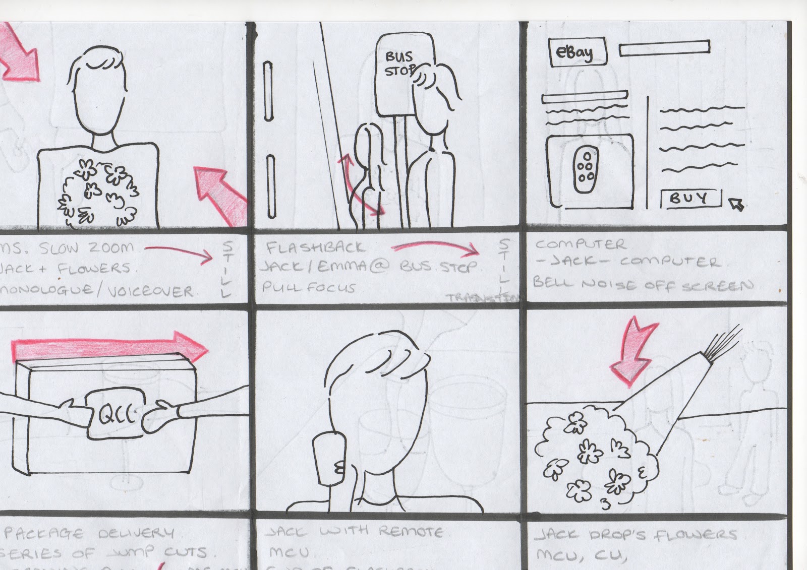
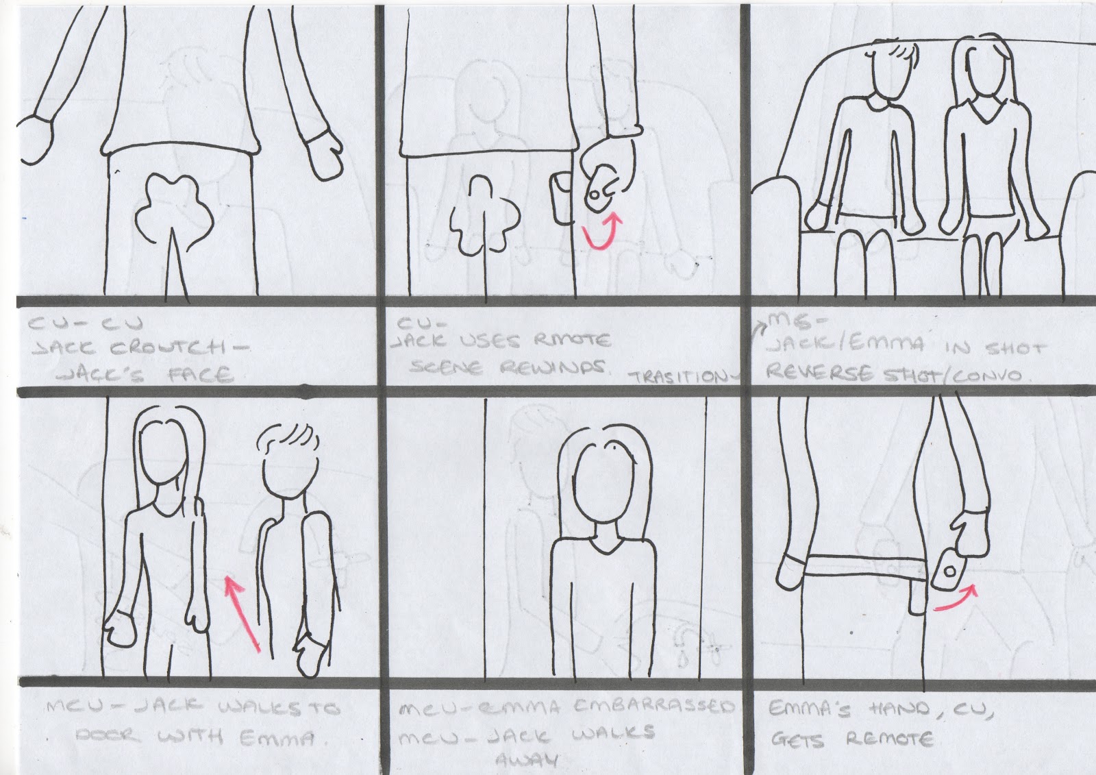
As part of our project we have to design and create a poster. For inspiration, I will research several film posters of the rom-com genre. I will look for the key features of the poster and the common features they share. Here is what I will look for in each;
  • Images and photos
  • Colour themes
  • Text and fonts
  • Position on poster/composition
  • It's relation to the film
I picked three random films, one of which has similar films to our own production, 50 First Dates, Along Came Polly and Bewitched.

Image and photos
Similarly, each poster has the couple the film is based on in a variety of situations. On 50 First Dates, Lucy looks shocked, while Henry is seeking her attention. The fact he looks at her and she is looking away presents the idea Henry is more interested in her which fits to the film. In Along Came Polly the roles are opposite, with Polly drapping her arm over Reuben as he looks away. Although the film is more about Reuben trying to win over Polly, she is a outspoken and flamboyant character and the pose matches her. In Bewitched, Isabel is presented as the powerful character and Jack is at her whim. Each of the posters feature a prop important to the film. Oddly enough, both 50 First Dates and Along Came Polly's is an animal character, a penguin and a ferret. 50 First Dates also has a ukulele, and in Bewitched a broom, mirroring the themes of the film as Isabel is a witch. The settings of the posters for 50 First Dates and Along Came Polly are in the filming locations used in the films, a beach and New York. 


Colour themes
50 First Dates has a beach theme for the poster so the colours are quite saturated and warm. The characters are also significantly tanned. The text has a theme of black then red text, such the actors names and film title, but with white for the third word. The poster credits are also red and the date of release in all white and bold to stand out. The tagline is in black to be in keeping with the theme. Along Came Polly has a similar theme of red and black with the text. Interestingly, the only text in red is the title, a one line review and the release date to make them stand out. The setting is very green and lush. The colours are again quite saturated and contrasts to the white banner at the bottom. Bewitched uses a very vivid blue for the sky to make the characters stand out and the text is white, apart from the release date, which is red. Similarly, all the posters have happy, vibrant colours, as rom coms are often considered nice, feminine and pretty films.

Text and fonts
All of the films use a smart and defined font. Bewitched has a slightly jumbled alinement of all the letters on its title, but it attempting to match the text used on the TV show the film is based on. The rest of the text is more straight. Each poster on shows the two main actors names and has small text with the production information. I will look more into this text and what it features in most films so we can create our own for our poster. 50 First Dates and Along Came Polly feature a tagline, but only Along Came Polly feature a quote from a review.


Positioning of the poster / Composition
All the posters have a similar composition, with the title a third down the page, with the poster credits underneath and the release date at the very bottom. 50 First Dates and Along Came Polly both have the characters in the centre and a tagline in the centre, whereas Bewitched is spread over more of the poster and doesn't feature a tagline. 50 First Dates and Bewitched have the actors names at the top of the poster, whereas Along Came Polly is below the characters. It also takes pride in a quote which rates the film at the top of the poster, even underlining it.

Relation to the film
The most important feature of any poster is its relation to the film. If a poster gives the wrong statement about the film, it will attract the wrong audience. A poster has to define the film so the audience has some idea what to expect. It should have some link to the plot and the story, the plot being what is explicitly present in the film such as the actions of characters, and extra non-diegetic material that only the audience see (not the characters) like title. And story being not only being what is explicitly presented on screen, but implied events, what the audience knows but isn't shown visually. So I analysed what was presented in each poster. All of the posters clearly present a romantic film, but Along Came Polly doesn't really have any elements of comedy. Perhaps they felt the audience could presume a comical plot due to the actors involved who are typically comedy actors. 
  • 50 First Dates:
    Plot - Title of the film, tagline, release date.
    Both plot and story - Goofy characters presented in facial expressions.
    Story - Women have the power in relationships (male dotes attention to female, she looks away).
    Relation to film - All relevant as the male character is completely at the whim of the female and weither she likes him or not throughout the film. The female is also presented as vulnerable which is apparent in the film as she struggles with a mental illness.
  • Along Came Polly:
    Plot - Title of the film, tagline, release date.
    Both plot and story - Two clashing personalities.
    Story - Sense of community even with opposite personalities, unity.
    Relation to film - Again, all relevant to the film. The characters are united as a couple throughout the majority of the film, even with very clear differences and conflicting morals, ideals and personalities. 
  • Bewitched:
    Plot - Title of the film, release date.
    Both plot and story - The female is a witch and performs magic on the male.
    Story - Women have a magic power over men.
    Relation to film - Once again, all entirely relevant. The female character is a witch in love with a mortal and perform magic on him and the world around her. He also has an attraction to her which seems to be "love at first sight" which has an element of magic. 


Thursday, 19 January 2012

Risk Assessment


Here is our completed risk assessment. After careful consideration of my shooting script, I created a list of possible hazards and accessed how to minimise the risk of causing harm to the people who could possibly be effected. All risks can be altered from moderate to low by following the steps I have outlined in the risk assessment.

Poster Research


Above is a selection of romantic comedy posters, which is also the genre of our film. By analysing these posters we can create our own poster for our own film.

First of all what images are used? In the examples above it is the two main actors, of whom the film revolves around, standing together.
The colours used are almost always bright and colourful. Such as the bright red dress in the ugly truth or the gold dress in how to lose a guy in 10 days. But the proposal, both the characters are wearing bland and dark clothing so your eyes are automatically drawn to the bright red letter 'the proposal'. The colours used need to attract the audience, if the poster has dull boring colours then it won't catch peoples eye.
The text and fonts used vary. For the actors names the righting is small and professional, the credits at the bottom of the posters are serious, whereas the titles are the most interesting fonts. With the main words either different colours or in bold. The title of the film is the biggest font, the actors names second biggest and then the credits are the smallest because they are the least interesting.
The layout of each of the above posters are all very similar. A format we too can follow when we do our own poster. The actors names are at the very top, then the main body of the poster is the two actors posing in a way that matches what the film is called, for example the proposal, Sandra Bulluck is proposing. Then the film title is either in between, the side of bottom of the actors. Then at the very bottom of the poster is the credits, followed lastly by when the film is coming out or 'coming soon'. The backgrounds are normally plain white or a light warm colour of some sort.

Overall, in relation to our film, these posters give perfect examples of how to do our own poster. We can follow the same layout, make sure the fonts stand out and the images overall are appealing to the eye. The two main actors in our film, ( Joe and Jen) can stand together in a silly pose that gives an impression of the film. For example Joe putting his arm round Jen and Jen looking uncomfortable.

Parts of the poster:
Credits


Poster credits are the legal lines that appear in movie posters giving credit to the cast and crew that made the film, as well as the producers, distributor and financier behind it. Poster credits are widely known also as “billing block” or “credit block”.
Poster credits have an average of 4 lines, usually laying in the bottom of the poster, underneath the title. For layout purposes, you can see poster credits with 6-8 lines justified left or right. Some times they also circulate around the edge of the poster. Poster credits can play an integral part of the design. There is not an official font for the poster credits, though Univers 39 Ultra Condensed is the most common.

Thursday, 12 January 2012

Filming and Editing Schedule

To keep up to date and organised, we will devised a schedule to plan the following days/lessons and when to film and edit.

Tuesday 10th - Delivery scene filming (COMPLETED)

thursday 12th - Delivery scene editing (COMPLETED)

Monday 16th - Editing - Viral Advert


Tuesday 17th - Bus Stop scene filming

Thursday 19th - Screen filming plus Bus stop scene editing

Monday 23rd - Blog work (Amy and Jade Absent due to exams)

Tuesday 24th - All remaining filming

Thursday 26th - Available for any required filming

Monday 30th/Onwards - Editing

Behind the Scenes: Viral Advert

Tuesday, 10 January 2012

Genre Research

Romantic comedy films are films with light-hearted, humorous plotlines, centered on romantic ideals such as that true love is able to surmount most obstacles. A dictionary definition is "a funny movie, play, or television program about a love story that ends happily".


One of the conventions of romantic comedy films is the funny parts and contrived encounter of two potential romantic partners in unusual or comic circumstances, which some have called a "meet-cute" situation. During a "meet-cute", humour is created by the awkwardness between the two potential partners by depicting an initial clash of personalities or beliefs, an embarrassing situation, or by introducing a comical misunderstanding or mistaken identity situation. Meet cute is sometimes described as "when boy meets girl in a cute way."
In many romantic comedies, the potential couple comprises polar opposites, two people of different temperaments, situations, social statuses, or all three, who would not meet or talk under normal circumstances, and the meet cute's contrived situation provides the opportunity for these two people to meet.

Examples of such films include:


Ground hog day, this film is especially similar to our short film as he does the same thing over and over again after learning from his mistakes. This is a great example of romantic comedy also as it is funny, centered on romantic ideals and has a happy ending.


This is another romantic comedy, which is similar to ours. Any mistakes that are made can be rectified the next day and again and again. The film is funny, but also about overcoming obstacles in the search of love. Another great example of romantic comedy.

Monday, 9 January 2012

Viral Advert - Creating A Banner

As the viral advert was being edited on Final Cut Express, it was my task to create a banner for the side of the video, which would feature realistic information found on typical television shopping show. It need to feature the name of the company and their logo, the name of the remote, it's notable feature and design, and most importunely a price. I had to create a suitable colour scheme and design the logo, which to do so, I used Photoshop Elements.

Stage One - The Banner
I create a long slim layer which would be placed on the left of the screen in our video. We choose to use red so I used the gradient tool and added a red to black gradient over the diagonal of the layer.

Stage Two - The Logo
Now I had to create the logo and add it to the top of the banner. So I created a document which was a small rectangle to compile the logo on. I made a black oval with a rough edge and then a smaller white oval inside then flattened them. Then I added text saying "C.V.Q" in black, and used the font "Engravers MT" and flattened the three layers. I added them to the original banner then expanded it to make it bigger.

Stage Three - The Details
I added the text, saying 
"Quantum Continuum Controller (QCC),
Model HD124. 
A universal remote,
with the latest technology to;
- Rewind time
- Play and pause time
- Fast forward time
Sleek design with
adjustable clip for
easy transport." 

Then I added and arrow which points to the product with the price on ("£29.99).
Here is the final banner. next we need to add it to the finished and edited video. We will add the bottom banner on Final Cut Express.


Monday, 2 January 2012

Audience Research

My Research
For my audience research I will create a questionare and distribute it over Facebook to a range of males and females beween the ages 16-25. It will generate information to help us select a target audience.

What I aim to find out;


  • Gender - Does our film appeal to both males and females, as rom-com ares usually targeted at women.
  • Age Group - have we selected an appropriate age group to target, what certificate do they see our film fitting into.
  • What do they expect from rom-coms.
  • What do they think of our idea.
  • What do they think of our ending?
  • Have they seen/enjoyed our relevant films? (Click, 50 First Dates, )
  • How can we improve our story. And most importantly....
  • would they watch our film? And where would they expect to find it.
The questionare will have to be short and easy to do. I will ask one question at a time and include a brief summary of the film to relevant questions. The questionare will be complete on Facebook Chat and I will add the screenshots to this post.

My Questions
First I created my questions:

  1. How old are you?
  2. Do you watch/enjoy Romantic Comedies?
  3. What do you expect to see in Romantic Comedies?
  4. Have you seen any of the following films: Click, 50 First Dates, Groundhog Day.
  5. ...and did you like them? If so, what was the highlight of the film for you?
  6. Our film is focused on a nervous young man, down on his luck, trying to impress his date. To correct his many embarrassing mistake, he uses a remote which can rewind time. What do you think of this basic synopsis? 
  7. When the film ends, Jack appears to have finally won over Emma, but as he leave Emma makes a mistake herself, and it is revealed she has a remote herself and has also been rewinding time. What do you think of the ending to our film?
  8. Is there anything you would like to see included in our film, or anything you think we could improve?
  9. Would you be interesting in watching our film?
The Results
I selected 5 individuals to question, here are the print screens of our conversations over the social network site, Facebook.


1) The ages of my participants were: 19, 14, 18, 19, 19.
2) Each stated that they watched rom-coms, and one even commented that they were her "fav!" meaning favourite.
3) Some were confused at first to what I meant by what to expect from romantic comedies, but all said they expected a couple, love, comedy or some combination. Some answers were very close to our film, for example Kayla's, who stated: making light of people's romantic issues? making romantic situations seem funny when in reality they're probably not?. And also Joe's who stated: boy meets girl,boy has to chase girl, everyone ends up happy in the end with lots of comedy 
4) One one of my participants had not seen any of the three films, and everyone else had seen Click, which is good because they will be familiar with the remote prop.
5) Chris highlighted the use of the remote as something he remembered about "Click" and that he "wanted one". This is a good result, as that's something we want the audience to question when they watch our film. These results show that our audience is capable of that with other films. He also mentions that he "likes Adam Sandler" proving that with comedies, your feelings toward the actor are important for enjoyment.
Everyone who had seen at least one film highlighted either a comedy moment or the general storyline as what they remember most.
6) Everyone like the initial synopsis, some stating it had the potentially to be very funny.
7) They also liked the ending of our film, and that it had a "good twists".
8) Each person told me something different which implies our film has a variety of possible events such as:
- a toilet incident
- a kissing incident
- a long speech
- a twist (which we already have)
- a sneezing incident
9) Every participant said yes.

  • Our film got a good reception from each individual, both from males and females which surgests we have made our romantic comedy relatable to men as well by featuring a male as the lead, as women are usually the target market.
  • Each individual showed elements of personality and fun throughout the questionnaire, compared to previous questionnaires on paper which get much more 'boring' and similar results. The results over the social network allow the participants to be more creative with their answers.

Sunday, 1 January 2012

Storyboards


Here are the storyboards I have drawn up to help me with framing during filming. I included the basic detail of the shots I chose to include with the characters involved, props and also arrows for either camera movement or a characters action. These illustrations will help me to visualise the shots while I set up the camera. It will help me to show the others in my group when we film if they want to film a particular scene.